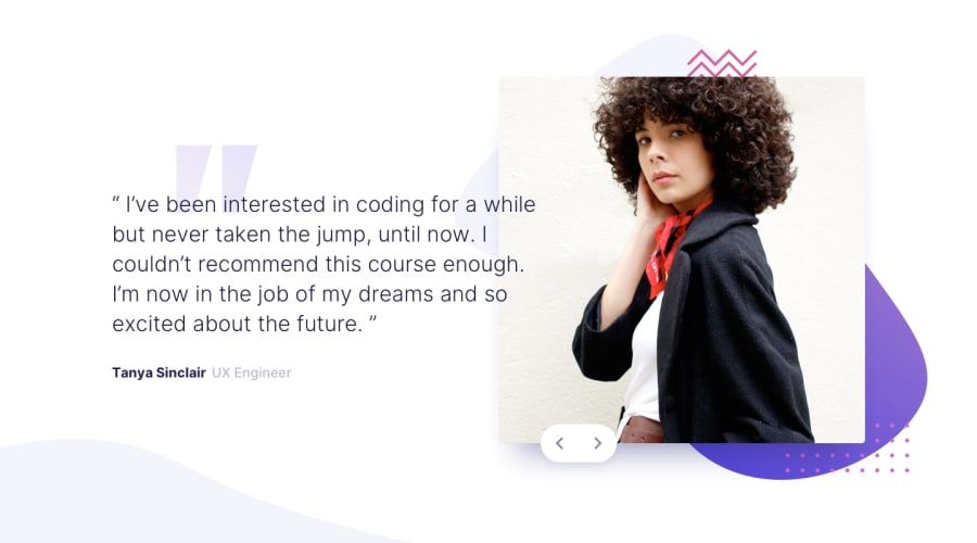
Design comparison
SolutionDesign
Solution retrospective
Hello everyone.
I hope you can help me. I think the design of the mobile is fine, but the problem is for the laptop. I have a problem with the top positions.
How could I solve it? And you can give me your opinion to improve, it would be of great help.
It is my first challenge :D
Community feedback
- @ovidiuantonioPosted over 4 years ago
Hello, nice solution, good job! You can improve it by doing the following things:
- you can add the div element that holds the 2 buttons inside the slider__image, to keep it in that range and just change the
topproperty withbottomand give it a value like 2rem. - you can add to the arrow images that are inside the button element the following property:
pointer-events: none;, this makes the images unclickable, (I saw that the area which you can click to slide was at the bottom and not the entire button)
Happy coding! Keep going!
1 - you can add the div element that holds the 2 buttons inside the slider__image, to keep it in that range and just change the
Please log in to post a comment
Log in with GitHubJoin our Discord community
Join thousands of Frontend Mentor community members taking the challenges, sharing resources, helping each other, and chatting about all things front-end!
Join our Discord
