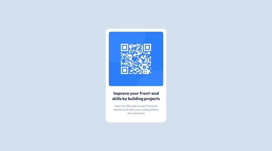
Design comparison
Solution retrospective
Its my first time do challange like this, often i scratch my head, why the visual look simple yet my code doest work as i intended. But Gradually each time my code look closer to design it pump me up to do more. It might not perfect but im proud to push myself to finish it.
What challenges did you encounter, and how did you overcome them?Translating from figma to actual code i thought it was easier, turn out it is not, maybe i am just inexperienced. I guess main problem come from this tunnel vision that i need to focus on figma design while i forgot to structure it simpler, html bone and flexbox structure.
What specific areas of your project would you like help with?Sometime when positioning element i have no idea what im doing. When i thought it work but its not Im just throwing padding, margin, to element.
Community feedback
Please log in to post a comment
Log in with GitHubJoin our Discord community
Join thousands of Frontend Mentor community members taking the challenges, sharing resources, helping each other, and chatting about all things front-end!
Join our Discord
