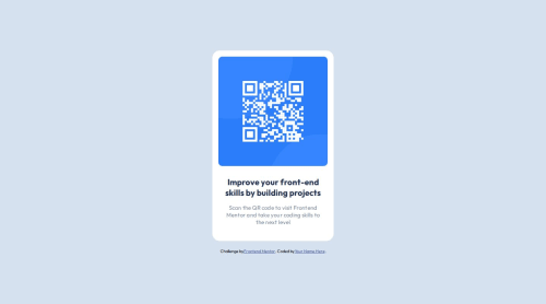
Submitted over 1 year agoA solution to the QR code component challenge
QR code component using html and css
bem, sass/scss
P
@yoyov51234

Solution retrospective
What are you most proud of, and what would you do differently next time?
- Finished it and uploaded the project to Git Hub.
- redo the project and know better on the center container , always learn new things from doing the old project
- use the morden css, flex to center the div
- pay attention on the description so that they are perfectly matched
Both desktop and mobile design work.
Code
Loading...
Please log in to post a comment
Log in with GitHubCommunity feedback
No feedback yet. Be the first to give feedback on yoyov51234's solution.
Join our Discord community
Join thousands of Frontend Mentor community members taking the challenges, sharing resources, helping each other, and chatting about all things front-end!
Join our Discord