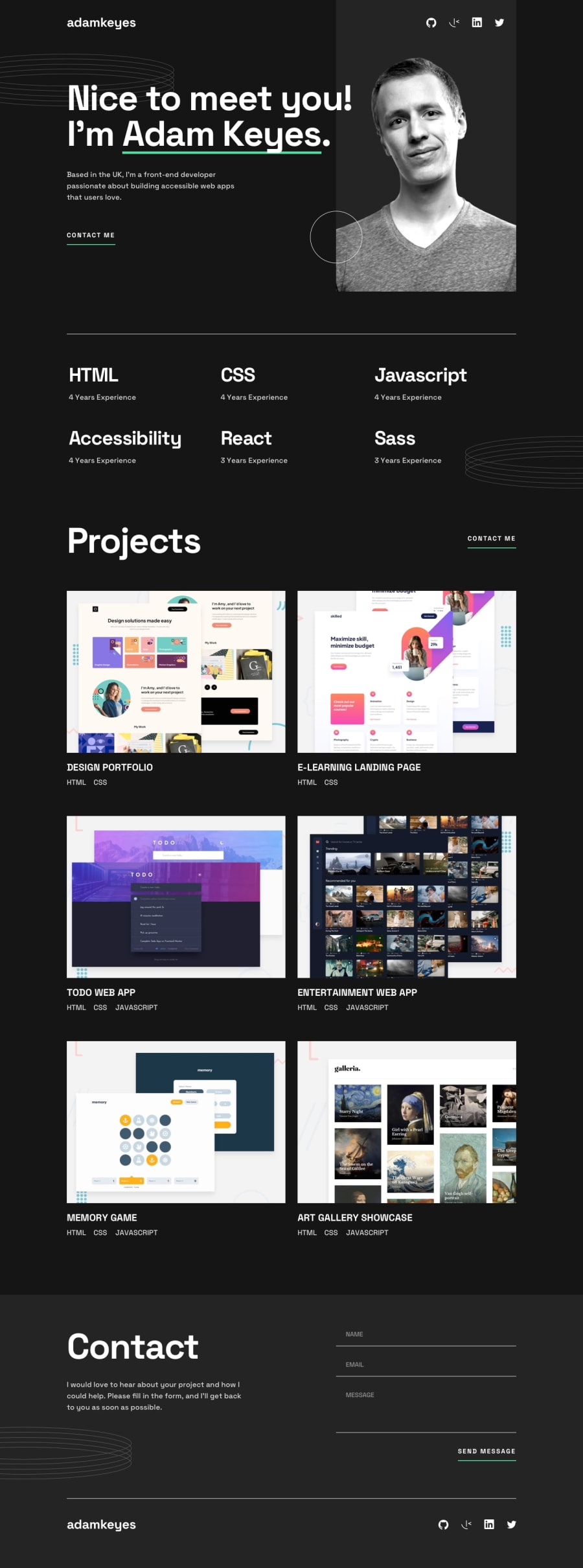
Design comparison
SolutionDesign
Solution retrospective
a couple of tricky CSS challenges, but nothing too fancy, made it my own personal portfolio
did a couple of design changes on the things I didn't like
- removed the white circle from the hero
- added overflow hidden on the circle patterns
Community feedback
Please log in to post a comment
Log in with GitHubJoin our Discord community
Join thousands of Frontend Mentor community members taking the challenges, sharing resources, helping each other, and chatting about all things front-end!
Join our Discord
