Not Found
Not Found
Not Found
Not Found
Not Found
Not Found
Not Found
Not Found
Not Found
Not Found
Not Found
Not Found
Not Found
Not Found
Not Found
Not Found
Not Found
Not Found
Not Found
Not Found

Submitted

Portfolio for Web Developer using Grid - Flexbox, SASS and JS

@guiyee89

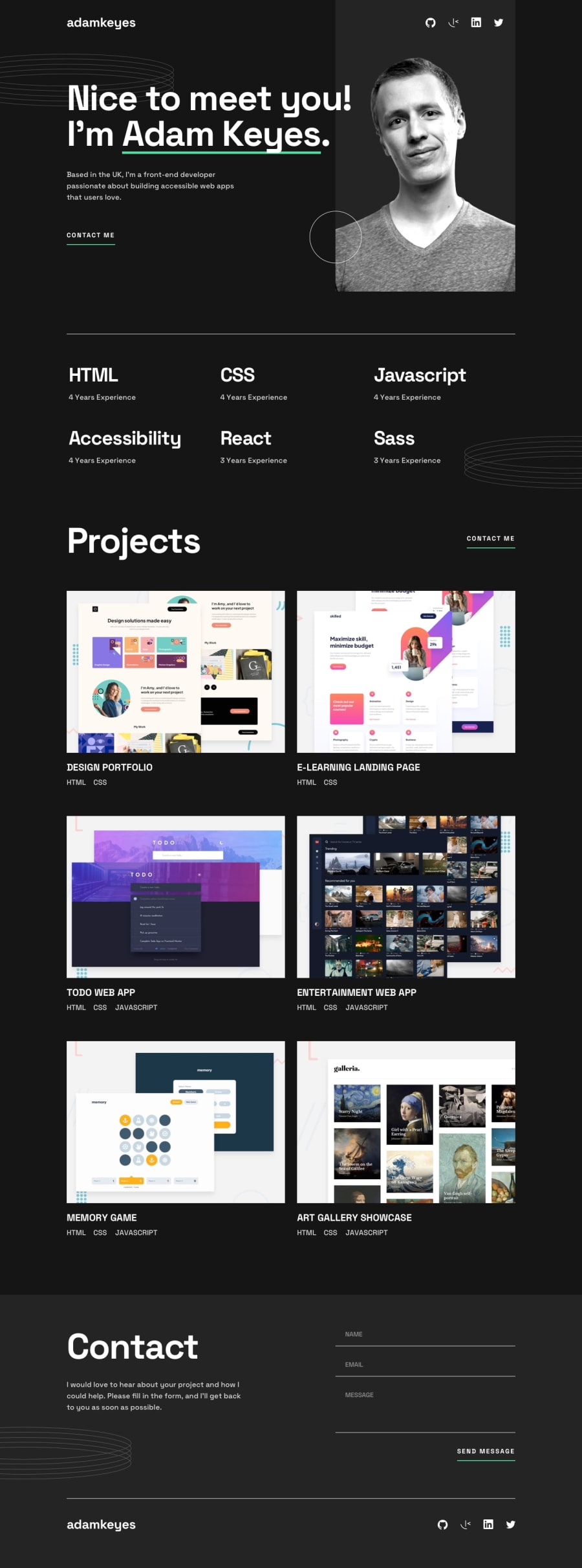
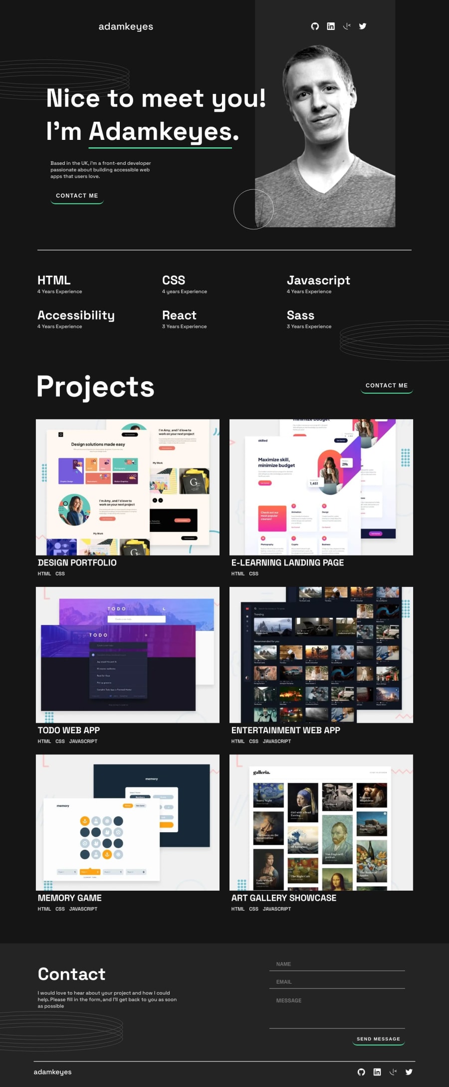
Desktop design screenshot for the Single-page developer portfolio coding challenge

This is a solution for...

  • HTML
  • CSS
  • JS
2junior
View challenge

Design comparison


SolutionDesign

Solution retrospective


During this project, I faced several challenges such as implementing form validation using regular expressions, adding animation and dynamic error messages to the form, and improving the accessibility of the website. Additionally, I also had to optimize the website's responsiveness for different screen sizes using CSS media queries. Overall, this project helped me improve my front-end development skills and taught me how to tackle complex problems while maintaining good coding practices.

Community feedback

Brendan 1,120

@OneManBanned

Posted

Hi, the solution looks nice but I have a few suggestions.

  • your project links are all buttons and don't go anywhere. They should be <a></a> that point to the corresponding projects

  • Most of the images in your html would make more sense as background-images in css.

  • I would use <h2></h2> for the section headers - projects, contact - and turn the skills-container into a <dl></dl> .

  • The spans underneath your <h3>'s would be better as <li>'s inside a <ul>

I hope you find that useful.

well done, Brendan

Marked as helpful

1

@guiyee89

Posted

@OneManBanned Hey Brendan! Thanks very much for your feedback! Definitely very helpful since I am still trying to learn to make my HTML as clean as possible. I will make all this changes as soon as I can!

Thanks a lot! Guillermo

0
T
Grace 29,250

@grace-snow

Posted

Hi

I struggled to use this because you've removed focus-visible styles from some interactive elements (it must work for keyboard users).

When I investigated this I noticed deep nesting in your css selectors, which is a very very bad thing! You want to keep specificity as low as possible. Stick to single class selectors in your css, placing classes directly on what you need to style

Other feedback

  • This is using landmarks incorrectly. You must have a header at the top level (not inside a section) then a main, then a footer. No sections outside of those landmarks. The hero content like page heading should all live within main ideally
  • The alignment of the header looks incorrect
  • Social links have no content at the moment. You must give links an accessible name (i.e. the platform) and in this case say that they open in a new tab. This would be better done inside the link with sr-only text instead of aria-label simply because aria-label is not reliably translated for all users
  • "Profile picture" is not descriptive alt text
  • You seem to have loads of repetition in the CSS. For example I can see in devtools that the html has FIVE different style declarations that are all exactly the same, and the hidden class declaration is declared 10 times...! This is terrible for performance, making the browser work hard to calculate and then overwrite styles again and again
  • Buttons are for actions, anchors are for navigation!! Contact me is navigation. Do not mess with window href, just use the correct element
  • The skills section is OK, but i think it would be better with a visually hidden h2 "skills" then all the subheadings turned into h3s. I also think this would benefit from being presented as an unordered list instead of a load of divs (optional though)
  • The projects all need to be in the same section as their heading! projects-container can be a div - it's only needed for layout, no other reason
  • All projects are inaccessible to me as a keyboard user because the buttons are hidden to me. Those buttons must be anchors again (they navigate)
  • Do not capitalise text in HTML. Do that in CSS
  • Whenever links repeat lots of times on a page (view project, view code, view project, view code... etc) they should be associated to the project name (heading) for screenreader users. EG aria-labelledby="unique-id-of-link unique-id-of-project-heading" or aria-describedby="unique-id-of-project-heading"
  • The technologies used underneath each project should be a list. They are definitely not headings! Headings are titles for other bits of content, so this makes no sense at the moment
  • You must never add a pointer cursor on non-interactive elements. That's very confusing for users
  • Similar to the previous section, I'd recommend making the project list into an unordered list
  • The contact section cannot sit outside of main. And similar to before, the form is not its own section! It belongs to the contact section already
  • The form is totally inaccessible because you've made labels display none
  • You also need to learn to programmatically link error messages to their input. The error messages can be display none until needed. But there should be a DOM element with a unique ID and an aria-live attribute wrapping each input's errors. Then the input needs aria-describedby pointing to that unique ID
  • It's much better for performance to call fonts in the HTML head instead of importing in CSS. You rarely if ever want to use CSS @imports
  • I beg you not to try and use bootstrap while learning! It is adding loads of unnecessary bloat in those CSS imports and is only going to hold back your learning. You don't need it. Once you've got CSS, HTML and JS on their own you will be able to pick up Bootstrap or any other library really quickly. I really cant work out how you've ended up with this CSS, it feels like loads of repetition has been copy-pasted in from other sources

Marked as helpful

0

@guiyee89

Posted

@grace-snow Wow thanks for such a detailed feedback! I will definitely try to make all the improvements as soon as I have some spare time! Bare in mind I only have 10 weeks of learning HTML CSS and JS.

No I haven't copy-pasted any CSS from other sources. I wrote it all. Every project I make I feel I get a bit better, but this feedback is amaizing!

Hope you don't mind answering a few questions:

-What do you mean by loads of repetition in CSS?

-When you say "nesting", you mean the SCSS? Or giving to many classes to elements?

Btw about the accesibility using the ARIA, I didn't know about this.

Again, I really appreciate taking your time to give this awesome feedback!!

0

Please log in to post a comment

Log in with GitHub
Discord logo

Join our Discord community

Join thousands of Frontend Mentor community members taking the challenges, sharing resources, helping each other, and chatting about all things front-end!

Join our Discord