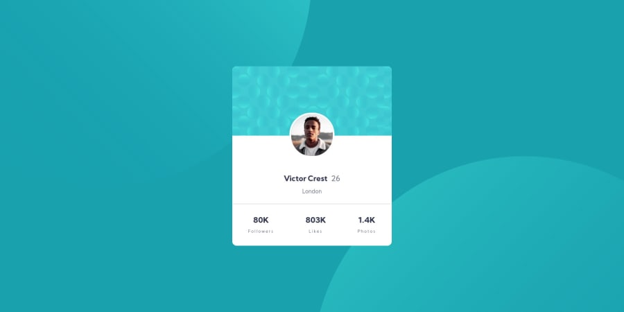
Design comparison
Solution retrospective
Hi there!
I am looking for any constructive feedback, specifically I am looking for advice on:
-
How to properly align the background images: As you will see, the background images on mobile do not resize properly. I tried a few ways to make them align properly by using position:absolute, but the bottom image kept increasing the page height. I would also love some advice on how I've structured the HTML, and if that is the correct way of doing this.
-
Aligning the Profile image: The profile image isn't cantered 100% accurately, and I've just used "top" and "right" to guess the correct alignment. Any advice on how to do this properly would be appreciated.
Thanks, Shivam
Community feedback
- @ApplePieGiraffePosted over 3 years ago
Greetings, Shivam! π
Good effort on this challenge! π
For the background images in this challenge, I suggest using CSS background images to add them to the
<body>
of the page (rather than creating a separate<div>
to add the background images). You can addmin-height: 100vh
to the<body>
to ensure that it fills up the entire height of the screen, and then use viewport units (e.g.,vw
andvh
) to position the background images (since doing so will prevent them from moving around very much when the size of the screen changes).As for the profile image, I suggest adding the image to
div.profile-info
and using flexbox to horizontally center it within its container. Then, you can use negative margin or the transform property to move the image up and into the blue background above it.Hope those tips help. π
Keep coding (and happy coding, too)! π
1@shivjoshi1996Posted over 3 years ago@ApplePieGiraffe Thank you so much! I will give your suggestions a try and see how I do. Thanks again!
1@shivjoshi1996Posted over 3 years ago@ApplePieGiraffe I've made the changes, and they worked great! The size of the card itself is a little larger than the design, but I think I am happy with how it currently is. Thank you again for your help!
1@ApplePieGiraffePosted over 3 years ago@shivjoshi1996
No problem, Shivam! Glad to help! π
I took another look at your solution, and I think the changes work well, too! π
And it's totally fine if your solution is slightly (or even somewhat) different from the design previewβthe preview is only there as a guide and things often turn out slightly differently in the end, anyway. π
Keep it up! π
1
Please log in to post a comment
Log in with GitHubJoin our Discord community
Join thousands of Frontend Mentor community members taking the challenges, sharing resources, helping each other, and chatting about all things front-end!
Join our Discord