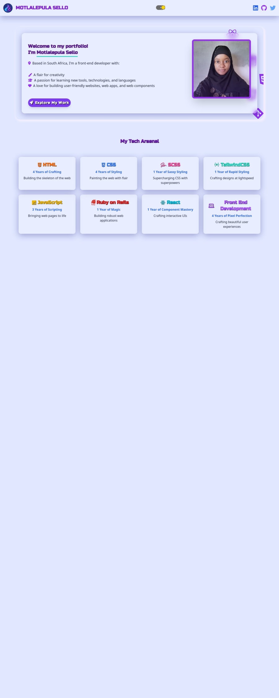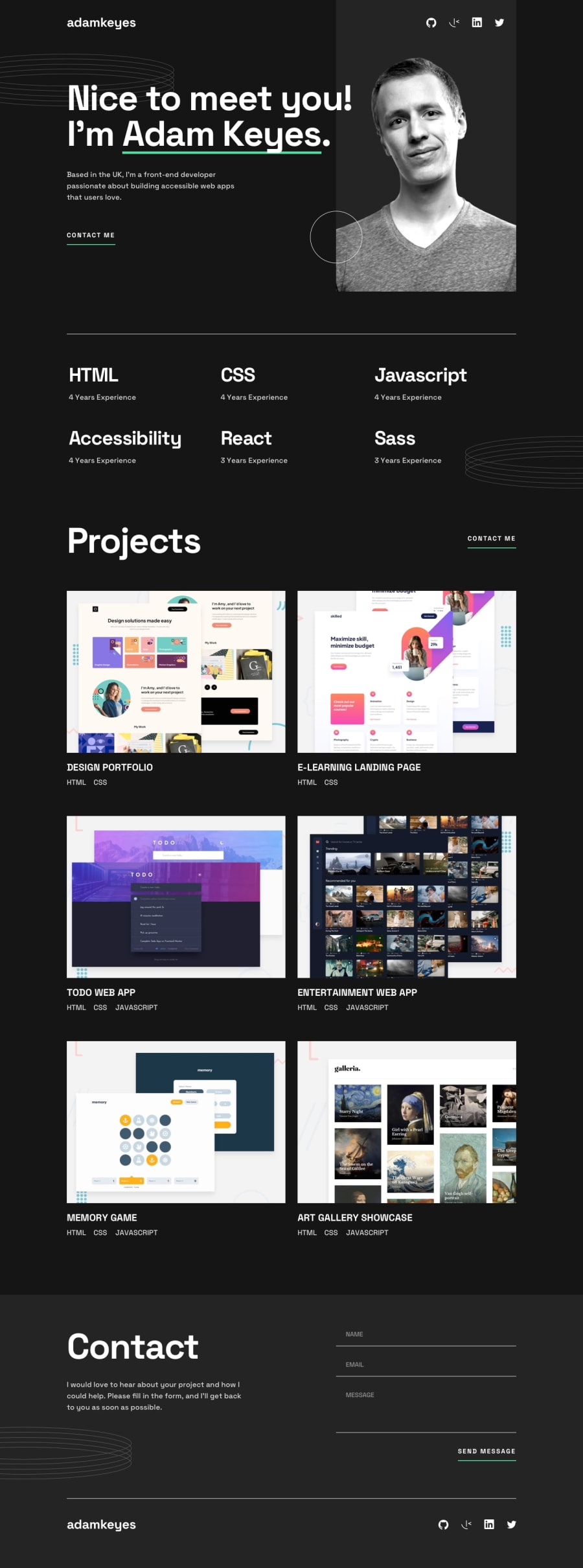
Design comparison
Solution retrospective
I'm most proud of my ability to bring something to life with the basics and still make it pop.
What I'd do differently next time is consider using a JavaScript framework to make it more robust and accessible. Hopefully with more to showcase within the website.
What challenges did you encounter, and how did you overcome them?It was pretty challenging to get the creative and responsive elements right.
I overcame them by re-hashing the flex and grid basics and leveraging them across sections to achieve a consistent flow across multiple screens and devices. It was also challenging to leverage Tailwind classes because some of them malfunctioned. I thought it was a version issue but decided to substitute the classes for basic CSS.
What specific areas of your project would you like help with?None. I simply hope to enhance the appeal of my skill set without having to over animate the website.
Community feedback
Please log in to post a comment
Log in with GitHubJoin our Discord community
Join thousands of Frontend Mentor community members taking the challenges, sharing resources, helping each other, and chatting about all things front-end!
Join our Discord
