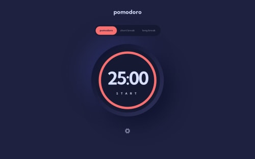
Pomodoro Timer using Chakra UI

Solution retrospective
I really appreciate the Pomodoro timer concept, and the appealing UI design is another reason why I chose this project. Additionally, I wanted to enhance my knowledge of CSS animation, making it the third reason take this challenge.
This is my second time use the Chakra UI, and I wanted to become more acquainted with framer-motion. That's why I built the "status bar" myself. However, I encountered several challenges with framer-motion, particularly because some instructions were not documented officially.
Luckily, I stumbled upon some amazing examples in the following link. If you're interested in framer-motion and want to delve deeper, this resource provides the best instructions available: https://blog.maximeheckel.com/posts/framer-motion-layout-animations/
For the next step, I made slight changes to the "Settings" page to ensure a consistent visual design throughout the entire interface. It was a lot of fun trying my hand at UI design. I drew inspiration from the concepts outlined in this article: https://www.halo-lab.com/blog/dark-ui-design-11-tips-for-dark-mode-design
And, the last challenge, is I was a little busy when I took this challenge. quite hard to concentrate on it. But still feel so satisfied when I finish this project. I look forward to making further improvements to this Pomodoro timer in the future.
Please log in to post a comment
Log in with GitHubCommunity feedback
No feedback yet. Be the first to give feedback on Po-Cheng Yeh's solution.
Join our Discord community
Join thousands of Frontend Mentor community members taking the challenges, sharing resources, helping each other, and chatting about all things front-end!
Join our Discord