Submitted 5 months ago
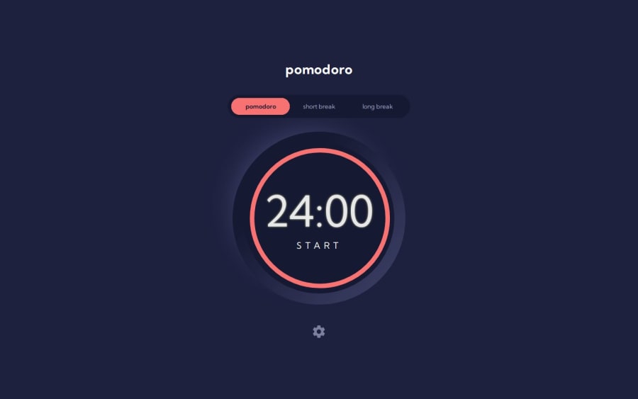
Pomodoro in Tailwind and Svelte with SVG
#animation#svelte#tailwind-css#vite
P
@35degrees
Design comparison
SolutionDesign
Solution retrospective
What are you most proud of, and what would you do differently next time?
I am proud that I could make a slick interface with a timer that works. I spent a lot of time learning Svelte state, and ended up with stores instead which I'm disappointed in. Also I spent time with the SVG line but it's not perfect.
What challenges did you encounter, and how did you overcome them?No idea how to do the circle, I had to spend time with several SVG tutorials and still don't feel fluent in it. Also lots of wrestling with the Svelte components and moving props. good exercise to improve.
Community feedback
Please log in to post a comment
Log in with GitHubJoin our Discord community
Join thousands of Frontend Mentor community members taking the challenges, sharing resources, helping each other, and chatting about all things front-end!
Join our Discord
