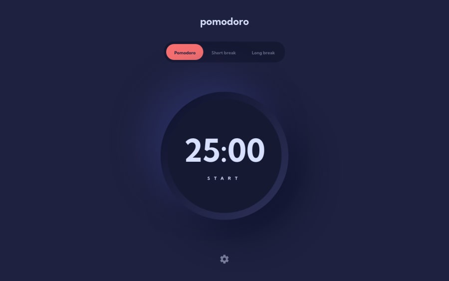
Design comparison
Solution retrospective
Things I've done in this project that I haven't done before:
- Used SVG to make an animated loader
- Used a web worker, so the timer would also work when the tab is not in focus
- Dynamically imported a Next.js component (the modal)
- Switched theme using CSS variables
Any feedback is welcome :)
Community feedback
- @ApplePieGiraffePosted almost 2 years ago
Hi there, Leon Pahole! 👋
Very nice solution! 🙌 The design looks great and the timer functions well! 👏
As your solution report suggests, it is advisable to include a heading inside of every
sectiontag you use to identify that block of content, so you may want to add some invisible headings in places (for screen readers) or use a different element altogether.Besides that, tiny nitpick is you may want to add some focus styles to the controls that change the font/color of the timer. 😉
Awesome work, once again! 😊
Keep coding (and happy coding, too)! 😁
Marked as helpful1
Please log in to post a comment
Log in with GitHubJoin our Discord community
Join thousands of Frontend Mentor community members taking the challenges, sharing resources, helping each other, and chatting about all things front-end!
Join our Discord
