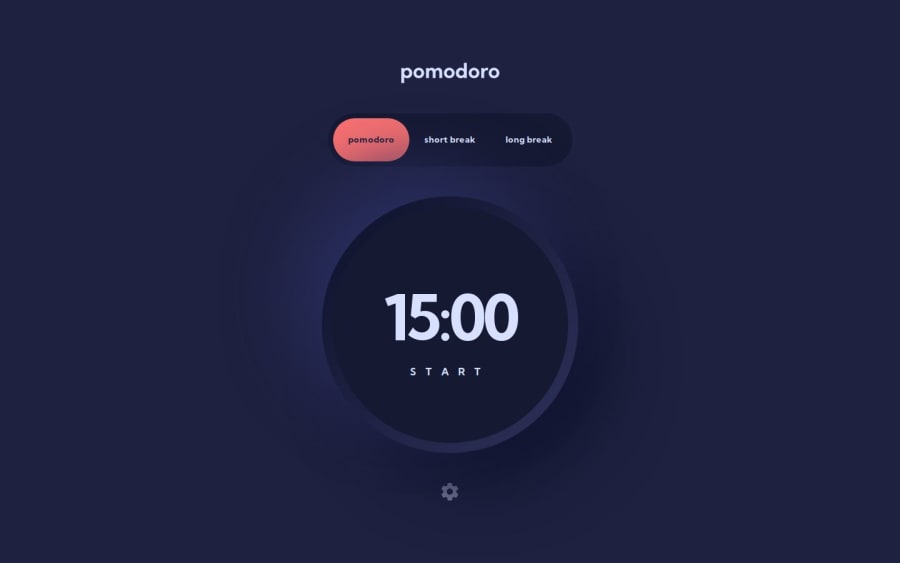
Design comparison
Solution retrospective
I was able to find usage of creating a custom hook. I've always read on how it can be good to create your own hook depending on usage but never applied it on any project of mine. Glad to apply it here.
As an improvement, when I revisit this again, I'll probably dissect the other components more and maybe break them down into smaller components or reusable ones. I got a tad bit lazy at the end and just wanted to finish it.
What challenges did you encounter, and how did you overcome them?It was a bit frustrating to learn how I could create the progress bar as I do not know SVGs that well. I am use to just using svgs and changing their fill color here and there. Nothing like this. So I needed to do a bit more research for it. All in all, it was fun. I am still curious how to handle it if I need it to be dynamic and have a size/circumference relative to the viewport but that's for the future me to find out!
What specific areas of your project would you like help with?A good resource on dealing with shapes, svgs, clippaths, etc., would be really appreciated. I am finding it hard to find resources that I am able to digest. It just all seems complicated to me at the moment.
Community feedback
Please log in to post a comment
Log in with GitHubJoin our Discord community
Join thousands of Frontend Mentor community members taking the challenges, sharing resources, helping each other, and chatting about all things front-end!
Join our Discord
