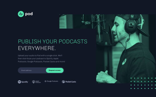
Pod-Request-Access-Landing-Page

Solution retrospective
Hi everyone!
I'm currently working on one of my most challenging projects yet, and I have a few questions.
Mobile Version Background Image: I'm facing difficulties getting the right shade for the background image in the mobile version. I've checked my other repositories (NFT, Product-Preview) but couldn't replicate the same effect. Could this be related to the z-index?
Scrolling in All Versions: I've noticed that all versions of my project have both vertical and horizontal scrolling. Is this acceptable, or is it generally preferred to avoid any scrolling?
I welcome any additional feedback you might have!
Thank you for your time,
Gerardo Garcia
Please log in to post a comment
Log in with GitHubCommunity feedback
No feedback yet. Be the first to give feedback on Gerardo Garcia's solution.
Join our Discord community
Join thousands of Frontend Mentor community members taking the challenges, sharing resources, helping each other, and chatting about all things front-end!
Join our Discord