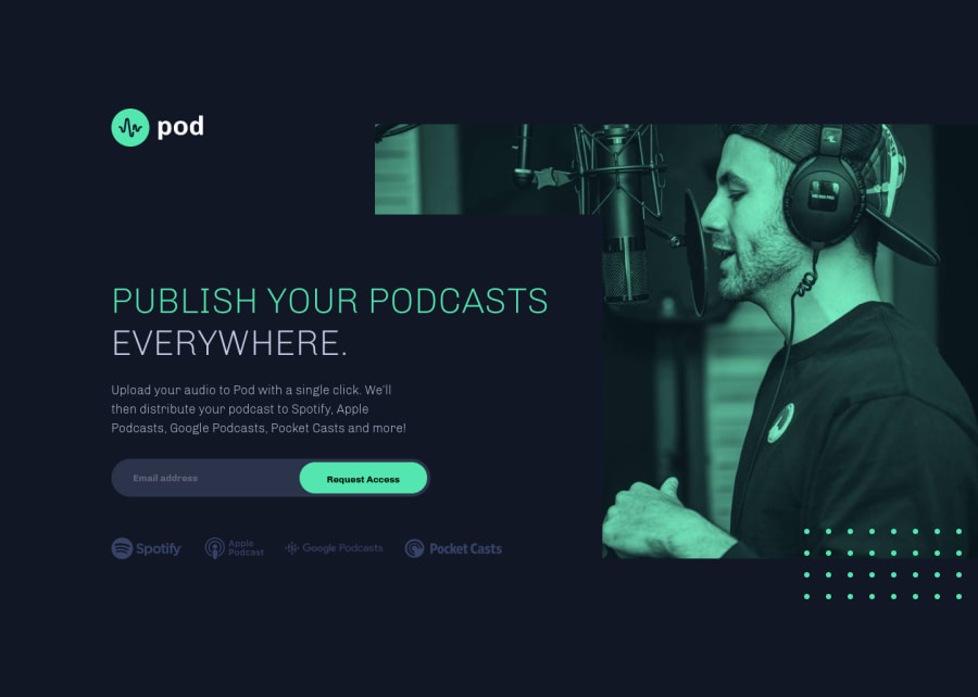
Pod request landing page with Flexbox and funky SVG icons
Design comparison
Solution retrospective
-
I had trouble getting the SVGs in an external file and then apply the filters in CSS. Couldn't make it work. Fixed it down and dirty now. Is there a way to properly do this?
-
Is there a good way to add styling to the autocompletion of an email input field?
Community feedback
- @ApplePieGiraffePosted over 3 years ago
Hello, Joran Minjon! 👋
Good job on another challenge! 👏 I really like the way the error/success messages smoothly slide in and out of view! 👍
The only minor thing I suggest is adding a
max-width
to the email input element and submit button so that they aren't too wide when the layout first changes from desktop to mobile.Of course, keep coding (and happy coding, too)! 😁
1@DrKlonkPosted over 3 years ago@ApplePieGiraffe Well, ok, only because you said so.
I also made some room for people with very, very long email adresses. Apparently, some people have those.
The length of my own email address, with which I tested, is just a little under average.
1 - @pikapikamartPosted over 3 years ago
Upon looking at it, your filter seems unnecessary in here since they provide the picture or the svg already filtered, so maybe your
background-blend-mode
could be remove in here. In your second question, I don't really know if there is, but if you probably know it by now, share it with us. Only that and good work^1@DrKlonkPosted over 3 years ago@pikamart I'm not really sure what you mean with your first comment. I put one filter on the podcast icons to give them the color of the design (which they aren't out of the box). The other filter works on hover. I only use the background-blend-mode to darken the background-image on mobile. So could you explain a bit more?
Thank you for your feedback! Much appreciated
0@pikapikamartPosted over 3 years ago@DrKlonk Oh I see, it's in the breakpoint the thing i'm talking about, I thought that you declared the blend mode for overall and looking at it again, you use transparent in the
min-width
breakpoint to hide the overlay. Okay okay my bad for that one sorry for the confusion0 - @sophiebushchakPosted over 3 years ago
Some feedback:
On a very small screen size, the platform SVG's shrink to be almost unreadable, you could probably let them stay a tiny bit larger until there's really no space for it: https://puu.sh/HtnSN/1ba6aed03a.png
Maybe put a max width on the content or find some way to scale the image and text block to be bigger, because on a 1440p screen it stops looking like the design at all and the image and text are completely separated: https://puu.sh/HtnT4/d6dd89649c.png
1@DrKlonkPosted over 3 years ago@sophiebushchak Thanks! I fixed both issues. The first by just keeping the icon size and wrapping it. And the background was a bit more work, because I needed to refactor it to a pseudo element, but that works as well.
1
Please log in to post a comment
Log in with GitHubJoin our Discord community
Join thousands of Frontend Mentor community members taking the challenges, sharing resources, helping each other, and chatting about all things front-end!
Join our Discord