Submitted about 1 year ago
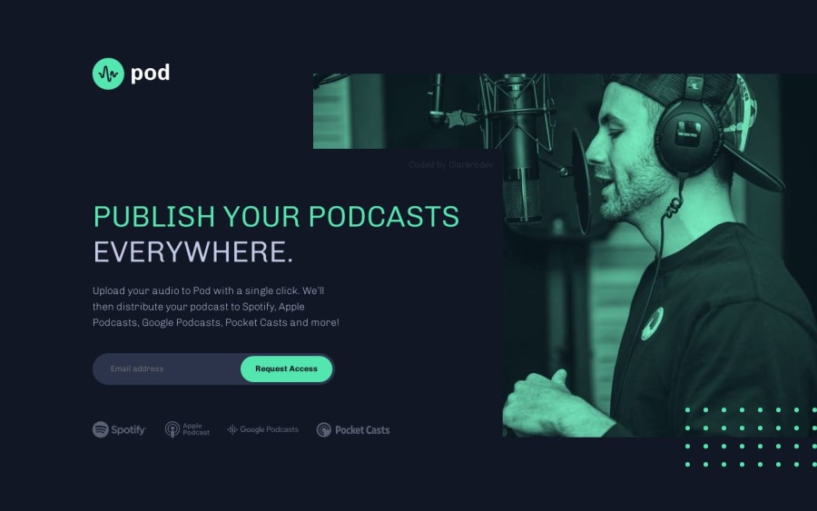
Pod request access landing page (Nx, Style dictionary, SASS and TS)
@Clarerodev
Design comparison
SolutionDesign
Solution retrospective
Hi all!
I'm studying good practices in SASS and Accessibility. That's my weak point here.
- About the sponsor section, should it be a link or only icon-information?
- I created a sr_only class to "hide" helpful text to screen readers, is it a good practice or how can I do it better?
Thank you for your help! I hope you like my solution :)
Community feedback
- @perbi-onasisPosted about 1 year ago
Hey Clarena, your solution looks pretty good and solid and your intention to make your site accessible too is on point but Screen Readers may not see it to read it if you implement display="none" or visibility="hidden".
Rather you can set the size of the element to zero or position it off the display screen (left: -99999999px top:-99999999px) to hide it.
Well done keep it up.
Marked as helpful1
Please log in to post a comment
Log in with GitHubJoin our Discord community
Join thousands of Frontend Mentor community members taking the challenges, sharing resources, helping each other, and chatting about all things front-end!
Join our Discord
