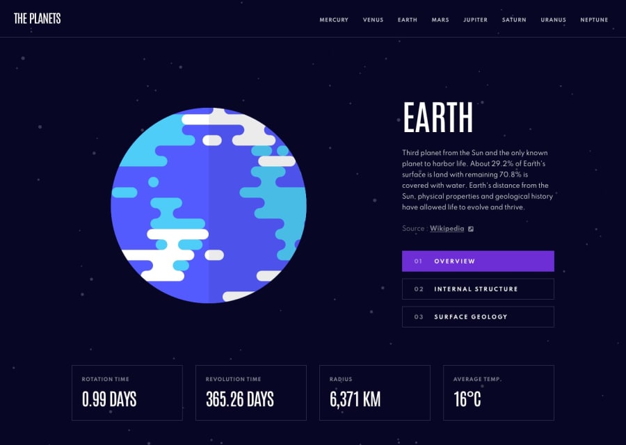
Planets project using React, React Router and SCSS
Design comparison
Solution retrospective
First attempt at using React Router in a project. I think it turned out alright! I tried my best to stick to "mobile first" CSS, so all of the CSS outside of media queries should prioritise mobile view with some breakpoints for tablet and desktop views where stuff started looking wonky.
Apart from a couple of sizing discrepancies, unless I've missed something I think it's mostly done! I've been staring at this on-and-off for a couple of weeks now so I'm probably missing something obvious but I wanted to get something submitted for now and go from there!
P.S. there's an Easter egg in there - try to find it without browsing the code!
Community feedback
- @visualdennissPosted over 1 year ago
Hi James,
this looks amazing! 🙌
I've accidentally discovered a very sneaky little bug: On larger screens, lets say up 1750px, planet-image-container (width:50vw) already starts to cover parts of the buttons and links like Source link (Wikipedia) or left part of Overview button etc so they become not clickable partly. Resizing even more, they mostly become not clickable. As a quick fix i've tried z-index: -1 for .planet-image-container and it fixed the issue, maybe there are even better solutions which i'm not aware of. I know its super tiny thing but still wanted to share as transparent part of the elements can be something really sneaky :)
Marked as helpful1@james-work-accountPosted over 1 year ago@visualdenniss ah good spot! I'll pop that in 🙂
To be honest the CSS could do with a bit of a general refactor; some of the selectors are a little specific for my liking nowadays and I've used a few explicit widths/heights where I shouldn't have. Maybe I'll get round to that one day 😅
1
Please log in to post a comment
Log in with GitHubJoin our Discord community
Join thousands of Frontend Mentor community members taking the challenges, sharing resources, helping each other, and chatting about all things front-end!
Join our Discord
