Planets Facts Site Challenge - ReactJs Mobile First Solution


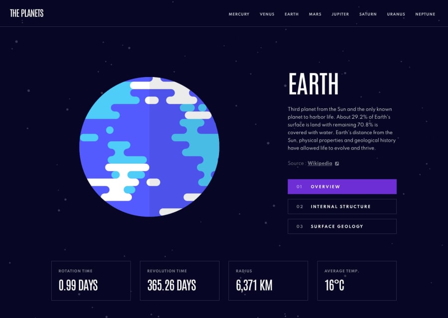
Design comparison
Solution retrospective
Hello fellow developers. This is my third solution. I chose the Planets Facts Site challenge. I decided to practice my React skills to build it. This was my first pass to get it up and running. I plan on doing some significant refactoring and breaking down it down into smaller components. In the meantime I wanted to get this submitted and posted. I'm open to any feedback, comments or suggestions for improvement.
Thanks and happy coding...
Steven Abaco http://www.stevenabaco.dev
Community feedback
- @pikapikamartPosted about 3 years ago
Hey, great work on this one. Layout is really good in desktop, the mobile as well is good. The desktop layout could have taken a bit more from the
mediabecause right now, it goes to tablet layout at point 1230+ px, which I think desktop could be present at that. For the mobile layout, it would be great for the 3 tabs don't take full width. Since right now, it is beingjustify-content: space-betweenthe 3 tabs are so far away from each other. Would be great to have amax-widthon the flex parent.I won't look in the javascript since like what you said, you are going to refactor it.
Still, some suggestions:
- The fonts are not applying for the planet links, you might want to check that one out.
- It would be great to have a
headerelement that will wrap the upper section, instead of just usingnav. - The website logo link should not have been inside the
navsince it is not really a primary navigation link. The structure would be great if:
<header>
  <div>
    <a href="/" aria-label="homepage earth"> The Planets </a>
  </div>
  <nav aria-label="primary">
    different planet  links
  </nav>
</header>
The planet links are the ones that is inside the
navbecause those are the navigational links. I added as well aaria-label="homepage earth"on the website logo link because it directs the user in the earth page, better inform user where it would take them.- There are multiple
divafter theh1tag. Check it out. - Do not use
tabindex='-1to an interactive element, this renders it out and won't be accessible at all. Right now, you can't tab on those selections about the current planet. - It would be great as well for the selections of information about the planet, is implemented to be a
tabbed interface. You might want to search that one out, it might be confusing to implement, but that will be a great accessibility feature on this challenge. - If you click on the
surfacethen inspect the image being rendered, you will notice that everyone'saltis being used asalt="earth"which should not be, it should be the current planet name as the value being used. You might want to check that one as well. - The bottom part, since those are list of information, it would be great to have them inside a
ulelement.
MOBILE
- Hamburger menu should have been using
buttonand not justdivwithimginside it. Usingbuttonwill make it more accessible, right now only by click events are triggering it, you can't use keyboards or other assistive tech.
Assuming that
buttonis used on the hamburger- The
buttonshould havearia-label="menu dropdown toggler"so that users will know what thisbuttondoes, it should also have aaria-expandedbeing set to it, triggering via javascript, helps user and informing them if it has expanded something. - The
svgon thebuttonshould havearia-hidden="true"so that it won't be pick up by assistive tech. - It would be great to have a focus trap on the dropdown.
- Also, on mobile, the fonts are not being rendered. Check that one.
Aside from those, really great job.
Marked as helpful1

Please log in to post a comment
Log in with GitHubJoin our Discord community
Join thousands of Frontend Mentor community members taking the challenges, sharing resources, helping each other, and chatting about all things front-end!
Join our Discord