Design comparison
SolutionDesign
Solution retrospective
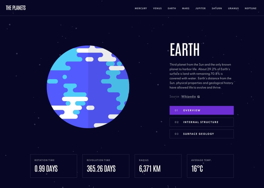
- Hey everyone, this is my solution for the Planets Fact Site! This site took me longer to build than I expected but I like the way it came out. I plan to use this site in my portfolio.
- I chose to use a JavaScript-heavy approach and I thought the hardest part of building this site was the layout. I had to make sure the site looked good when switching between the mobile, tablet, and desktop layouts. I had to make sure that when a user clicked on "Overview" or "Surface Geology" in the mobile site for example, the tab that they selected was correctly displayed in the tablet and desktop layouts.
- Let me know what you think of the site and any feedback is welcome :)
Community feedback
Please log in to post a comment
Log in with GitHubJoin our Discord community
Join thousands of Frontend Mentor community members taking the challenges, sharing resources, helping each other, and chatting about all things front-end!
Join our Discord
