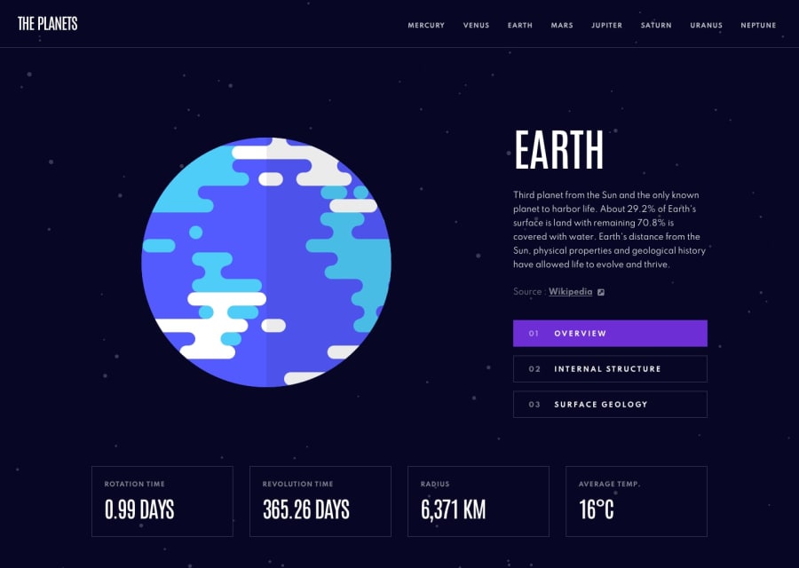
Planet facts site using React/Next.js
Design comparison
Solution retrospective
Hi all,
This is my first submission using React/Next.js. All of my other submissions have been "vanilla" html, css, javascript. I feel like I could definitely clean up my code and make it a little more efficient. I feel like it's a little repetitive. I had some issues "sticking the landing" on this one. I feel like the last 10-15% took a similar amount of time as the first 80-85%.
A few issues/areas for improvement
-
I feel like the templated feel of this site (each planet having the same page just with different content) means I could basically loop over the data.json and create a page for each entry, but I'm not sure how to do that. So, instead I manually made a page for each planet. I also feel like I had to pass in a lot of props. I ended passing 10 props into one component. I'm sure there's a cleaner way to do this.
-
I feel like the imagery takes longer to load than it should, especially the zoomed in view of the planet's surface. Whenever I click on the button that shows that view, it takes a good second or 2 before it shows up. Not sure why because these images are so small.
-
I kind of cheated and for the home/index page, I just basically copied the same exact code for the Earth page instead of re-directing the home page to the Earth page. Not sure how to do that.
-
I'm sure there's plenty of more room for improvement. Suggestions/tips are welcome, as always!
Community feedback
Please log in to post a comment
Log in with GitHubJoin our Discord community
Join thousands of Frontend Mentor community members taking the challenges, sharing resources, helping each other, and chatting about all things front-end!
Join our Discord
