Design comparison
Solution retrospective
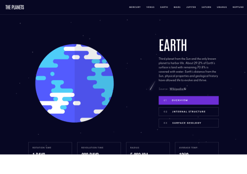
I am wondering how close clients typically expect the final product to match to layout. I spent too much time trying to get the dimensions to match exactly, and sacrificed some responsiveness for it.
Community feedback
- @leaninghowtousegitPosted over 3 years ago
The only issue that i found in your project was in the mobile view, where when your click in the overview, surface, or structure, the customer do not see that small bar with the color appearing before the button (or text inside the button).
But i thing thats the only thing i've found.
Congrats again!
Marked as helpful0@seanred360Posted over 3 years ago@leaninghowtousegit Thanks for taking the time. I am always looking for bugs. I left out the colors on mobile on purpose. I just looked at the Figma file and it seems it was supposed to be there. I totally missed that! Thanks again.
0 - @JeanMiesesPosted over 3 years ago
Man, I am working on the same project and I love what you did here. I also took a quick look at your code, and I am so jealous lol. Way better than mine. I hope to be as good as you someday. The only thing I would try to change from your code is to move the planet array to a separate file and then require it to main.js. BTW, I will try to use anime.js as well on my project.
0@seanred360Posted over 3 years ago@JeanMieses Thanks! that's very nice to say. I tried to import the .json file already and I cannot figure out how to do it and then use the data. So I just pasted the whole file in like you see there.
0 - @leaninghowtousegitPosted over 3 years ago
Hey Sean, nice to meet you! My name is Claudio.
Coincidently i finished planets fact site yesterday too :) I made small changes from the original (https://www.frontendmentor.io/solutions/vanilla-html-css-and-js-no-frameworks-no-libraries-w5zsuWPyL)
Loved, loved, loved the animations of your project. From the moves of the planets images to the animation of the menu in the mobile view. Great work! Congrats.
You told that you had to sacrifice the responsivity but, in my opinion the layout is pretty responsive. I tested multiple screen sizes and saw no bugs in your project.
Congrats for the hard work.
0
Please log in to post a comment
Log in with GitHubJoin our Discord community
Join thousands of Frontend Mentor community members taking the challenges, sharing resources, helping each other, and chatting about all things front-end!
Join our Discord