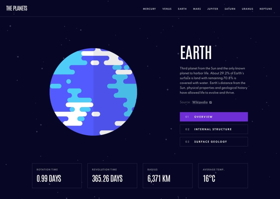
Design comparison
Solution retrospective
Put a lot of effort and time into building this site using plain HTML, CSS and JavaScript. Created my own CSS design system for the same. Would greatly love feedback and comments on the following:
-
Is my site accessible, and have I missed anything in terms of accessibility in my code?
-
Is the CSS design system good, or do I need to make any changes to it?
-
Is my usage of CSS grids and flexbox correct, or do I need to make some modifications to it?
Any other feedback or comment or tip would be greatly helpful!
Community feedback
- @ApplePieGiraffePosted almost 2 years ago
Hey, Adithya! 👋
Amazing work on this challenge! 👍 This is a rather large project and you've built it with just vanilla HTML, CSS, and JS! 👏
I think overall you've done a great job with the layout and styling. Just a couple small suggestions,
- For the fact boxes along the bottom of the page, the smaller text should be a heading element and the numbers should be
pelements (not the other way around). Even though the numbers are larger in size and may be styled like a heading, it is the smaller text that identifies each box and what each number means. - If the tabs that change what info is displayed about the planet don't navigate the user to another page, they shouldn't be links. Using the
buttonelement would be more meaningful and fitting in this case. - I noticed that the mobile menu automatically opens when it is focused in the mobile layout. This may not be such a good idea as it can confuse users who weren't expecting/desiring the menu to open up and there is no way to close the menu again unless an option is selected.
Moving forward, I'd like to suggest looking into using a framework to build larger projects like this. It will save you a lot of time and effort and make creating reusable layouts, components, and designs much easier. React and Vue are popular frameworks worth learning, but my personal favorite (and a great place to start if you are beginning) is Svelte. Just a tip for next time! 😉
Hope you find these suggestions helpful. 😊
Keep coding (and happy coding, too)! 😁
0 - For the fact boxes along the bottom of the page, the smaller text should be a heading element and the numbers should be
Please log in to post a comment
Log in with GitHubJoin our Discord community
Join thousands of Frontend Mentor community members taking the challenges, sharing resources, helping each other, and chatting about all things front-end!
Join our Discord
