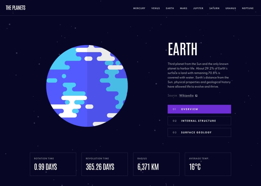
Design comparison
Solution retrospective
This is my solution for this multipages website. Any feedback on how to improve it will be highly appreciated. ;)
Community feedback
- @YazdunPosted over 2 years ago
Hi Andro, Great job on this challenge, This is actually one of my most favorite challenges on the frontend mentor. There are three main issues with this solution :
- Your page's layout will break on wide screens.
- Your project is not structured properly.
- You took a wrong approach ( I explain why in depth )
Now I'm going explain each issue.
1. Page's Layout : I started with this one since it's the most easiest to fix. You have written a scss class called
main_containerinside./styles/Home.module.scssand used it in various places..main_container { width: 100%; }Now, You've applied this class to the elements which are block level by default and taking 100% width is their default behavior, There is no need to apply this class to them.
But what happens if the user is browsing our website in an ultrawide monitor ? Do we want our container to fill the whole screen ? The answer depends on the project itself, but for this project the answer is clearly no, because we don't have much content on the screen so it's better to control the container's width, so you can easily update
main_container:.main_container { width: 100%; max-width: 80rem; margin: auto; }With the above's approach, our container fill 100% of the available space but when it hits width of 80rem, it will stop growing and we will have a better looking layout on a widescreen.
Also you need to use background svg which was provided with the starter files.
2. Project's structure : This mainly comes back to components directory but I'd like to mention some more issues that I would've personally change :
-
You've used SCSS for styling but you haven't used any powers of SCSS, so why not use plain CSS instead ? If you are using SCSS it's better to at least embrace some of it's powers, if not, then it's easier to remove the SCSS complexitiy from our project and use simple plain CSS instead and sharpen our fundamentals. CSS itself is super powerful !
-
It's better to create a specific folder for each component so our codebase becomes more readable to other developers. You approach is working and it's fine, But in the eye of another developer who wants to contribute to your codebase, it's extremely cluttered. So it's better to put each component inside it's own specific folder.
-
It's better to create an
index.tsfile inside./componentsand export all components from there, so in case we want to use multiple components somewhere else, we can import them all at once from./components/index.ts. -
Since we are using Nextjs, Vercel highly recommends us to make use of Absolute Imports and Module path aliases. It's really easy to configure and all you need to do is adding
"baseUrl": "."to thecompilerOptionsinsidetsconfig.json.
3. You chose a bad approach
This is the most important one and this can really hurt your project, Now you've used a fancy carousel and it has awesome transitions, but you've created a huge issue with choosing fancy stuff over performance ! Here is why :
-
What if our users wants to share surface geology section with their freinds ? No matter what url they send to their friends they will land on planet's overview when they click on it.
-
What if someone search for venus internal structure on the internet and they don't care about venus's overview or surface geology? Shall we expect them to land on overview and then look for internal structure button and manually click them?
-
What if our user is making a research on planet Mars and she wants to bookmark Mars's surface geology so she can return to it later for multiple times? Each time she must land on overview and then choose her desired tab which becomes annoying overtime and we will definitly lose our user right there!
The solution to this is, creating a sub route for each specific section, There will be a main page for the planet which shows the overview, and other tabs should be a separate sub page on it's own, so search engines and users can make better use of our website.
If you want to stick with the carousel approach, You must at least implement a functionality so we can point to the specific carousel tab with the page url ( You can use a query for this ).
Overall you did a great job, I hope this helps you to improve your coding skill. I also opened a PR to your repo which fixes some of these issues that I mentioned.
Marked as helpful3@Andro87Posted over 2 years agoHi@Yazdun! Sorry if I only respond to you now. I highly appreciated your suggestions: they helped me improve how it is better to approach a project. As for the PR, I looked at it and appreciated it, but I would like to implement your changes on my own cause I think that doing them by myself right now is the better way for me to understand them and improve. Thank you so much for the help and explanations! I think they were among the best I have ever received! I’m currently working on the project and trying to improve it. Happy coding!
1
Please log in to post a comment
Log in with GitHubJoin our Discord community
Join thousands of Frontend Mentor community members taking the challenges, sharing resources, helping each other, and chatting about all things front-end!
Join our Discord

