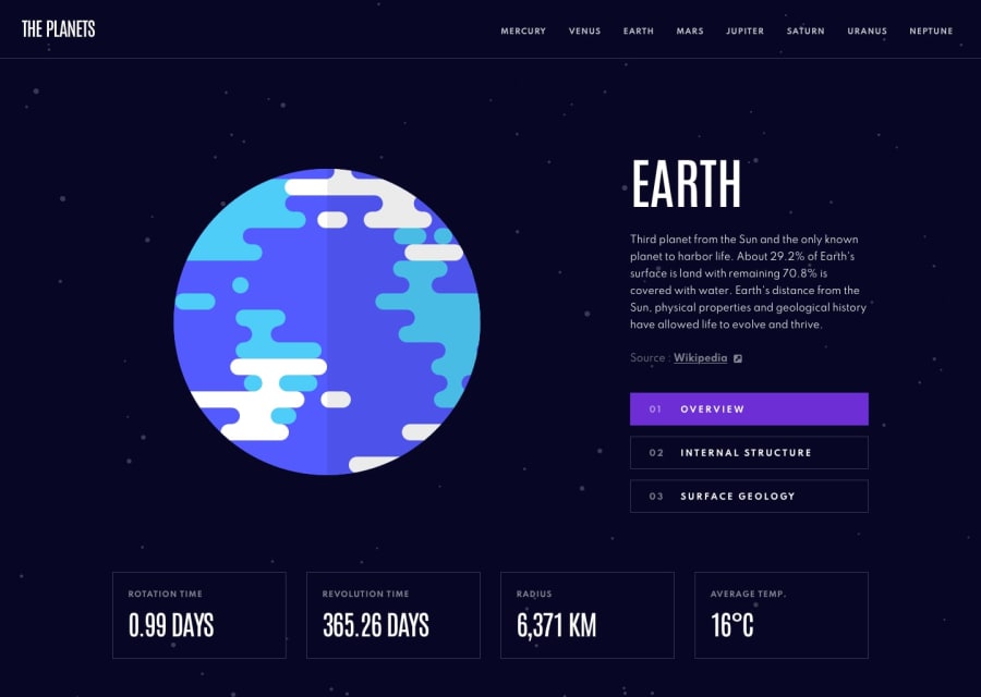
Responsive website done using React/NextJS (SSG), Tailwind, Storybook
Design comparison
Solution retrospective
This is the first project where I've done static site generation :)
Work flow:
- Set up the project architecture and conventions
- Convert the design system (from figma) into tailwind configurations
- Build the components (component-first development)
- Set up the layout with fixed data
- Dynamically load the data from the data.json file
Areas I'm not sure of/not very ok with:
-
There were lots of custom tailwind values here and there in the tsx files, in particular, the font sizes differ according to the screensize. Ideally, this is already laid out in the corresponding figma file's design system. As the sizes are a bit arbitrary and are in fixed pixels, I decided not to fully rely on the tailwind.config.js file
-
The NextJS docs for static site generation mentions "creating a top-level directory" for data fetching (see: https://nextjs.org/learn/basics/data-fetching/blog-data). I didn't follow this and instead created a directory from within
src/so that I can still use the custom types I've prepared when fetching the data from the data.json file. -
I didn't supply a fixed height and width for the images -- I think the images should follow their original size. I also used the native
<img>tag instead of Next'sImage />tag since the latter requires me to supply values for the height and width. I'm not sure how to handle that and I keep getting warnings during build that I just keep ignoring. I'd appreciate anyone's opinions on this matter :)
Community feedback
Please log in to post a comment
Log in with GitHubJoin our Discord community
Join thousands of Frontend Mentor community members taking the challenges, sharing resources, helping each other, and chatting about all things front-end!
Join our Discord
