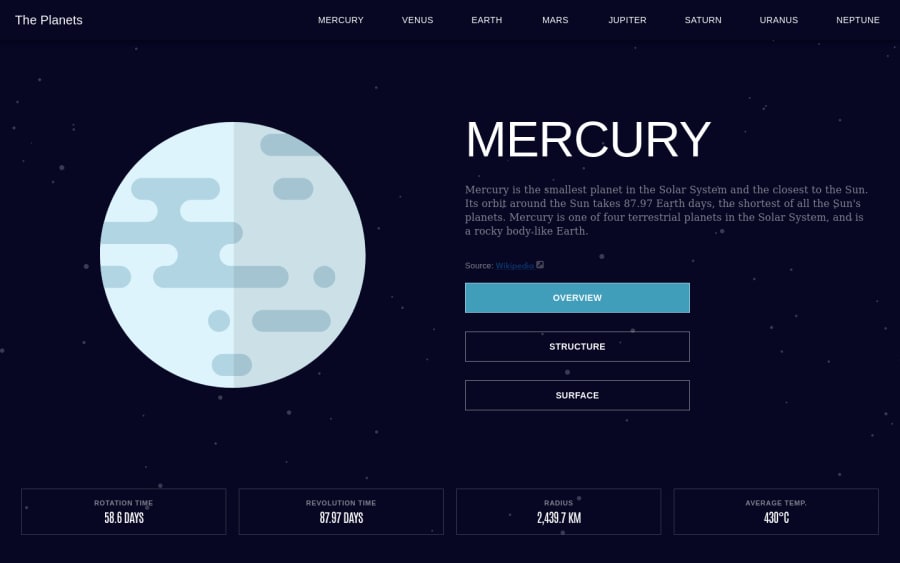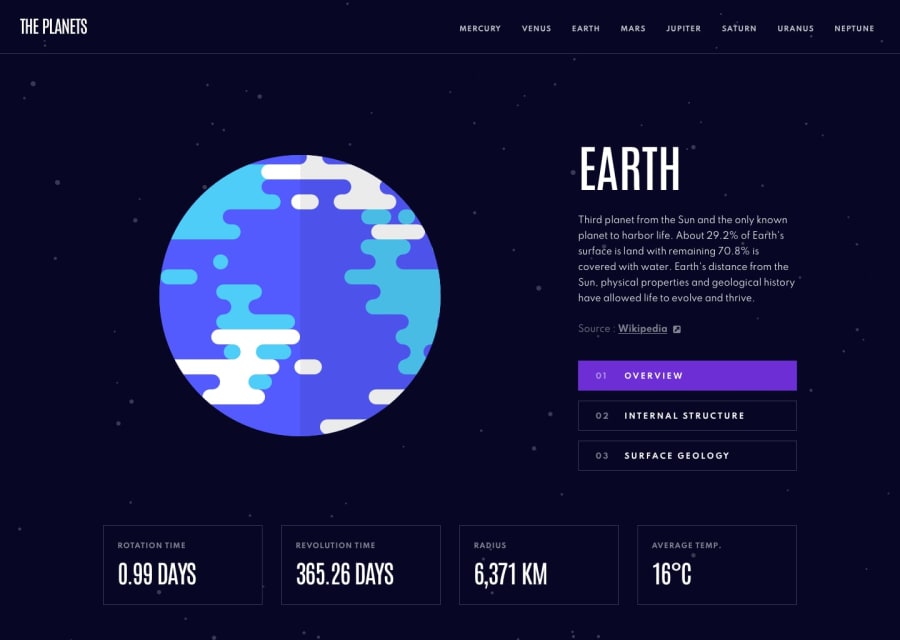
Planet Facts Site w/ React & Material UI
Design comparison
Solution retrospective
A bit of a challenge, but had a ton of fun building this one! I was pretty happy with how the JavaScript stuff turned out and feel the functionality is pretty good (first time using Context and man, it is a lifesaver).
However, definitely learned here that I need to improve my CSS / Responsive Layout skills. This was my first time using Material UI and I did feel in the process I was trying to learn MUI more than getting better with CSS. It was definitely appreciated for components like the Responsive Drawer, but it also brought along some agitation with trying to override styles etc. I think in the future I am going to learn Tailwind as that should help improve CSS skills.
Going forward I think taking a couple of hours setting up my ideal layout would be a better idea. I often get so excited when starting a new project I hop right in and it can lead to problems down the road. I had the JS and functionality down pretty quick, but getting the elements to swap position from tablet & mobile to desktop was definitely a challenge. I didn't want to use Position: Absolute to get the Desktop Layout, but ended up being the only way I could see getting that part correct at that point.
Community feedback
Please log in to post a comment
Log in with GitHubJoin our Discord community
Join thousands of Frontend Mentor community members taking the challenges, sharing resources, helping each other, and chatting about all things front-end!
Join our Discord
