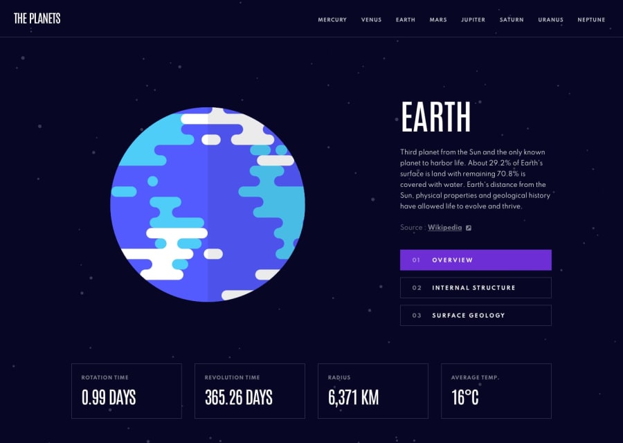
Design comparison
Solution retrospective
Wanted to refresh myself a bit with Vue. Good exercise for it. Nothing too complex but enough going on to make use of Vue's store manager and update components/UI accordingly. Implemented a basic little carousel effect to create a scrolling space background. Not perfect but somewhat pleased with its result. I also added a UI effect to the navbar/header by injecting the selected planets assigned color. Actually thats one instance Im not thrilled about as there is a fair amount of redundant(ish) CSS in creating these unique classes and I'd imagine something like SASS would have allowed me create something a bit more dynamically. Feedback and suggestions welcomed! 🙂
Community feedback
Please log in to post a comment
Log in with GitHubJoin our Discord community
Join thousands of Frontend Mentor community members taking the challenges, sharing resources, helping each other, and chatting about all things front-end!
Join our Discord
