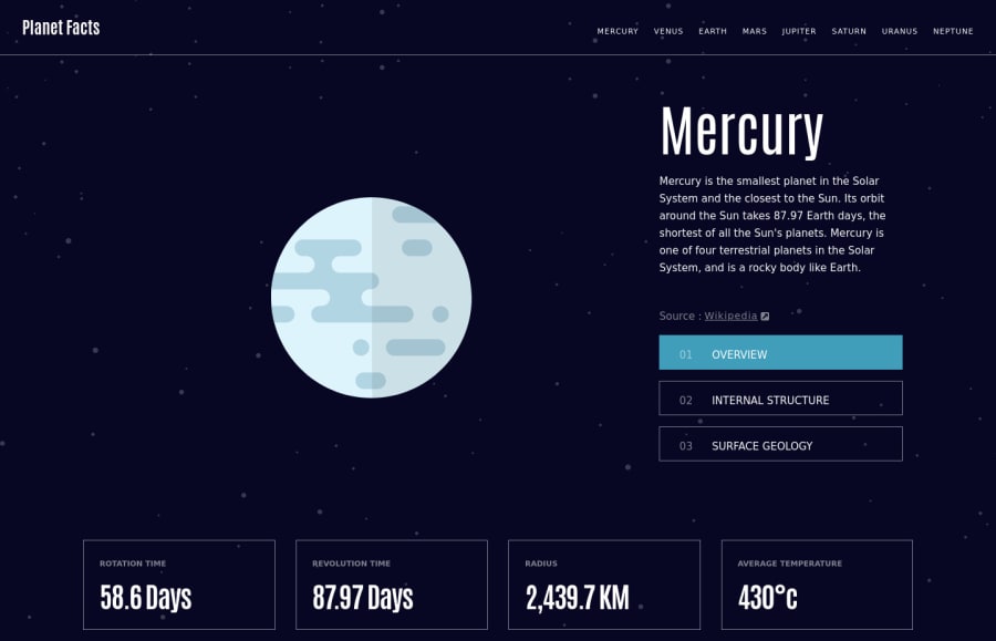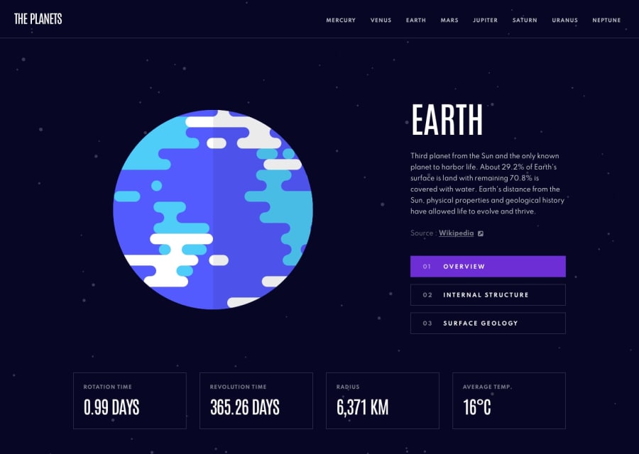
Design comparison
Solution retrospective
Used this challenge as an opportunity to learn Svelte. Very happy with the framework and will continue to use it in the future. If you have any thoughts or critiques I would be happy to hear them. I always enjoy learning from my mistakes. Thank you for looking at my project.
Community feedback
- @YazdunPosted over 2 years ago
Hi Joe, great job on the challenge. This looks very clean and it's also responsive on all sort of devices. I specially love the animated hamburger icon 😁
I don't know Svelte so I can't talk about your code, but there is a really serious issue in this project which you should be aware of.
Imagine this is a production level project, and our user is doing a research on the Jupiter. She wants to bookmark Jupiters internal structure so she can come back to it later and use it as reference, right now there is no way to point exactly to Jupiters internal structure and she must first land on the website, then click on the Jupiter, then click on the internal structure ! We will definitely lose our user right there !
Now imagine another scenario, Someone is reading Uranus surface geology and he finds it very interesting so he decides to share it with his friend, Now whatever URL he sends to his friend, they will land on Mercury overview 😁
This can also completely destroy the SEO since there is no way for search engines to show exact results to the users.
The solution to this issue is, creating separate pages for each planet and then creating sub pages for each category, for example : planets.com/earth/structure . Or if you don't want create pages, you must at least implement queries so users and search engines can point to a exact planet and sub category, for example : planets.com/solar?planet=earth&category=geology .
Overall, Great job and keep coding 👏
Marked as helpful2@TheShonuffPosted over 2 years ago@Yazdun As always I appreciate your input on my projects. I originally intended to have the project setup with routes as you described. I even had most of the .svelte files generated and organized. However I decided to pivot at some point and choose the lazier route I suppose.
I checked out your solution and was inspired to update mine a little bit an animated background. You're solution was so slick and beautiful looking.
1 - @elaineleungPosted over 2 years ago
Hi Shonuff, I think this was very well done, and am definitely saving it for future reference since I'm hoping to learn Svelte. The only suggestion I have is to add a bit of transition effect for the SVGs/ graphics when clicking through the different links/states. Other than that, it's just great work you've done here, and I wish I know Svelte to give you comments on your code, but anyway, at least I can give you comments on usability!
Looking forward to more 😊
1@TheShonuffPosted over 2 years ago@elaineleung Thank you for looking at this project. I was looking into adding some transitions while I was writing the project but couldn't understand the right way to implement the svelte transitions. I just took another stab at it and I think I got something working. I'll dial in some more when I have some time. Thanks for pushing me to do more.
0
Please log in to post a comment
Log in with GitHubJoin our Discord community
Join thousands of Frontend Mentor community members taking the challenges, sharing resources, helping each other, and chatting about all things front-end!
Join our Discord
