

Design comparison

Solution retrospective
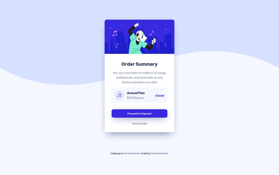
Since this is my first challenge on Frontend Mentor, any Feedback is appreciated. Had some trouble with the colors, figuring out what the colors are when the payment button is hovered. Also the positioning of the 'Annual Plan' and Plan Price was something I'm unsure about. I have tried my best to match it with the template, do let me know if there's an easier/efficient way to do the same.
Community feedback
- @omirasPosted over 3 years ago
Hi!
Very good work! Here's my simple suggestion: you may use max-width to determine the max width of the container; so the plan details do not look too wide when the viewport increases:
https://oscarm.tinytake.com/msc/NTcwOTY5NV8xNzY0NTA3Ng
Regards,
Marked as helpful0@prathmeshgodsePosted over 3 years ago@omiras Thanks a lot for the suggestion Oscar! I have implemented the change. This will be very helpful in future projects as well.
Also thank you for taking out the time to create that video explanation :)
1

Please log in to post a comment
Log in with GitHubJoin our Discord community
Join thousands of Frontend Mentor community members taking the challenges, sharing resources, helping each other, and chatting about all things front-end!
Join our Discord