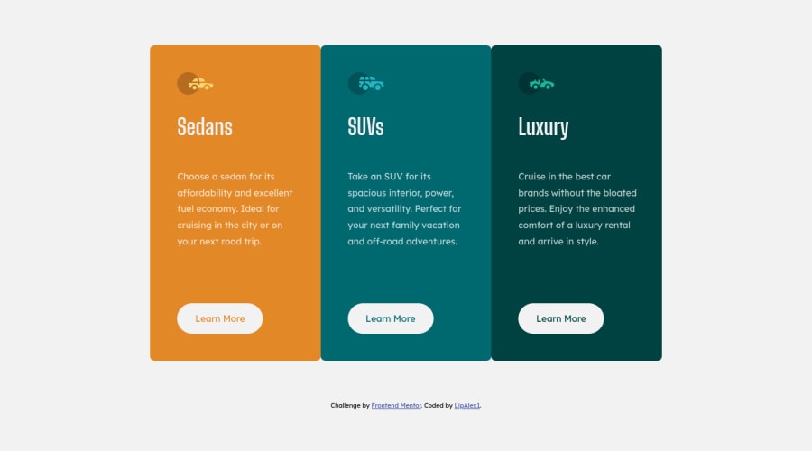
Design comparison
Solution retrospective
Hi, guys!
This is my 3rd project with plain HTML, CSS and Flexbox.
Pls, let me know if you find any redundant code!
How do you like the commenting?
I used a seperate stylesheet for the rules for mobile devices. What do you think?
Pls, read README_FINAL for more details.
Many thanks in advance!
Community feedback
- @grace-snowPosted over 2 years ago
Hi
This doesn't look like the design (I'll add Screenshots to slack so you can see what I see viewing on mobile)
The reasons is the way you're using viewport widths is not good. I understand why you're approaching it like this, but it's not the way to create a responsive design. Lose all the viewport widths and use max width on the component instead (in rem).
Add a little margin on the component or padding on the body to stop contents hitting the sides of the screen on small screens
All that needs to change in media query is the flex direction and max width - it's 2 lines so definitely doesn't need a separate stylesheet.
In the html, the icons are decorative IMO, so I'd leave the alt attribute blank. And you don't need to wrap the anchor tags in a div. You can just set the class on an anchor to be display block / inline-block / inline-flex
I hope this helps
Marked as helpful1@LipAlex1Posted over 2 years ago@grace-snow Hi! Thanks again for the advice! Without you mentoring me on this project I don't know how long it would have taken me to wrap my mind about the genuine idea of responsiveness!
0
Please log in to post a comment
Log in with GitHubJoin our Discord community
Join thousands of Frontend Mentor community members taking the challenges, sharing resources, helping each other, and chatting about all things front-end!
Join our Discord

