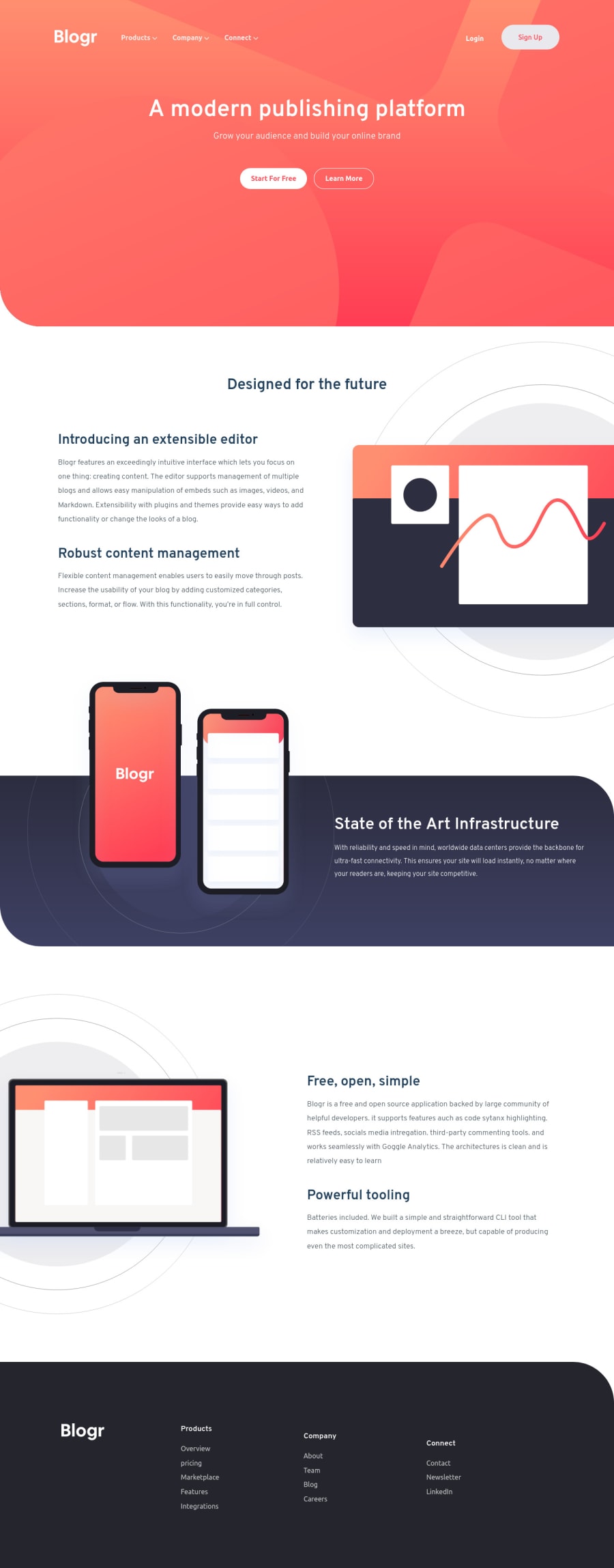
Design comparison
Solution retrospective
This was by far the most stressful and tedious project I've worked on I'm just glad it's over
Community feedback
- @elaineleungPosted about 2 years ago
Hi Daniel, I had to laugh when I read your write up because I couldn't agree more 😂 (I was like YES I'm not the only one!!), since I wrote something similar in mine as well 😅. Well I'm just glad someone else shares the same view (and misery)!
Anyway, just some quick comments about the footer: In desktop view, the three columns of links in the footer navigation appear to be centered vertically. You'd want them to be pushed to the top instead, so try
align-items: startinstead of center.For the images: In mobile view, you can try adding a max-width for the images in the intro section and open section so that they don't get super big before the breakpoint. Also, for the phones image, you can try centering it by adding
justify-content: centeroninfrastructure-img.By the way, great job on the responsiveness and also in positioning everything together!
Marked as helpful2@d2ni3lPosted about 2 years ago@elaineleung Hi Elaine, Thank you for the response, I just finished editing my code by using your advice and I was able to this project more responsive. Adding the max-width to the open and intro section image was really helpful Thank you for the advice!
1
Please log in to post a comment
Log in with GitHubJoin our Discord community
Join thousands of Frontend Mentor community members taking the challenges, sharing resources, helping each other, and chatting about all things front-end!
Join our Discord
