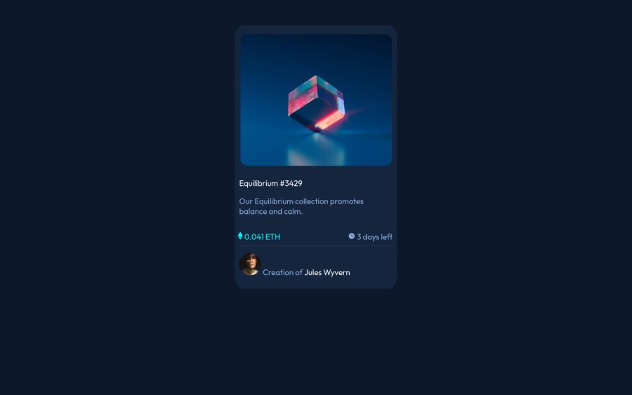
Design comparison
SolutionDesign
Solution retrospective
- The last part where we were to place image and text part next to each other (w/o using flex box or grid)?
Community feedback
- @dostonnabotovPosted almost 3 years ago
Hi, there! That looks great! I think, you have to add
paddinginside the card to give some breathing room. In terms of flexbox or grid, useflexin this case. Because, it is easy to implement, by just settingdisplay: flex; align-items: center; justify-content: start | center | space-between. Use it yourmain and footersection. Or I would suggest to create utility classes and use it. Also, you can review my solution as well. Good luck!Marked as helpful1
Please log in to post a comment
Log in with GitHubJoin our Discord community
Join thousands of Frontend Mentor community members taking the challenges, sharing resources, helping each other, and chatting about all things front-end!
Join our Discord
