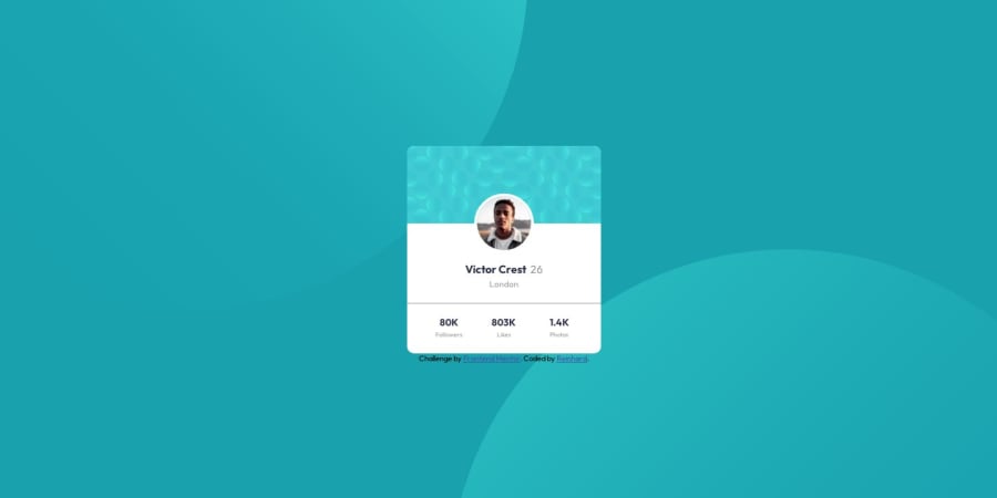
plain basic html and css, layout with flex and 1 grid container
Design comparison
Solution retrospective
Hi everyone! As I am still beginner, this task had some challenging issues. I had a lot of troble positioning the two background images. And still I have difficulties in positioning and layouting the various elements of the website in a clearly structured manner. I feel like messing around with flex, grid, margin, padding and position until it the result looks more or less similar to the original. 😂 Hope this will improve with more practice. The challenge was great fun, I appreciate any kind of feeback! Greetings!
Community feedback
- @0xabdulkhaliqPosted over 1 year ago
Hello there 👋. Congratulations on successfully completing the challenge! 🎉
- I have other recommendations regarding your code that I believe will be of great interest to you.
BACKGROUND iMAGE 📸:
- Looks like the background images has not been properly set yet, they are slightly misplaced.
- So let me share my css snippet which helps you to easily apply the
background colorwith thebackground svgthey provided to place perfectly as same as design.
- Add the following style rule to your css, after completing these steps you can experience the changes.
body { background: url(./images/bg-pattern-top.svg), url(./images/bg-pattern-bottom.svg); background-position: right 52vw bottom 35vh, left 48vw top 52vh; background-repeat: no-repeat, no-repeat; background-color: hsl(185deg, 75%, 39%); }- Tip, Don't forget to generate a new screenshot after editing the
cssfile
.
I hope you find this helpful 😄 Above all, the solution you submitted is great !
Happy coding!
0
Please log in to post a comment
Log in with GitHubJoin our Discord community
Join thousands of Frontend Mentor community members taking the challenges, sharing resources, helping each other, and chatting about all things front-end!
Join our Discord
