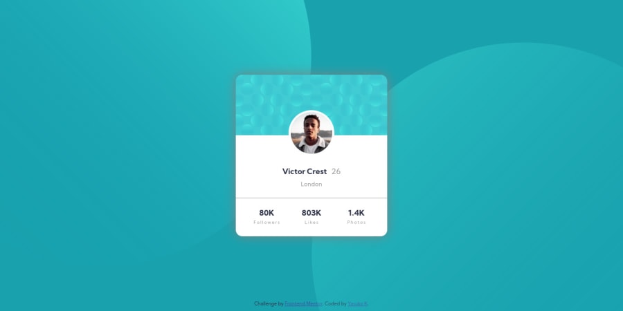
Design comparison
Solution retrospective
How I placed the background images were complicated and I don't remember... It will be great if I can know the strategy.
Community feedback
- @grace-snowPosted almost 4 years ago
Hi there,
I used pseudo elements to place my background images so there is no need for media queries or changing values at different screen sizes. You can see my solution here. You might find the code complex to understand as I've used scss, but you should learn just by opening in browser and inspecting elements with dev tools.
I hope that's helpful.
1@grace-snowPosted almost 4 years agoIn your solution, it looks fine at first glance but there is one big issue that needs fixing in the code...
You've used divs for everything. You need to use semantic html elements. Divs are only for structural / layout choices and should not be used to contain content. (Again, see my solution for an example.)
You don't need to empty all the starter files out of your repo. It's important to keep the readme even if you choose to change it a bit. And the design folder is really helpful for code review in these challenges.
Eg I cannot see the bg circles on mobile which I know are meant to be visible from the design, but I only know because I've done this challenge and seen the design a lot. Others might not know about those images.
Looking at css, it's nicely structured and easy to read. You've chosen your own naming convention, but that's fine as it's understandable (that might be the kind of thing you document in a readme/documentation of a real project so other developers know the format to follow) The biggest issue in the CSS though is you're using a lot of exact pixel values for things. Doing a layout by setting heights and margins in pixels could be problematic. What happens if the content is a lot shorter or longer, or odd screen sizes are used, or the user has zoom settings on... Things can start to break so just be careful with these
Make sure you check your solution at lots of screen sizes above and below the designs provided (zoom in and out in the browser) and don't forget about mobile landscape orientation (devtools device emulator is good for this)
Sorry that's a big brain dump of info there! 😂 I hope you can decipher helpful nuggets from it.
All the best
1@yasuko-kPosted almost 4 years ago@grace-snow Hello! I opened your solution and check the code. These were very organized! Your comments have very clear reasons why I have to care the details. And it's helpful how I supposed to start the project with the provided file. I appreciate it a lot. So far, it seems how to organize the information before I start will be the key for me! I'm going to modify my code being more careful. Thanks!!
0 - @anglicusPosted almost 4 years ago
I'm sure there is more than one way to deal with the backgrounds, but here is something I tried using calc. I set the image sizes to 1024px, and then positioned like this:
For the top circle: left: calc(50% - 1024px); top: calc(50% - 1024px);
For the bottom circle: right: calc(50% - 1024px); bottom: calc(50% - 1024px);
Basically this makes it so that as the window gets smaller more of the circle gets pushed off screen, and the edges of the circles will stay in the same relative position to the card as you change the size of the window.
You can change the 1024 to different values if you want the circles to be closer or farther. Changing the 50% value will also make it so they move a little with respect to the card as you resize the window (I set mine to 55% and 45% instead of 50% just so it felt a little more "alive").
1@yasuko-kPosted almost 4 years ago@anglicus Hello! Thank you for the idea to use calc. I didn't think of calc at all, so this is will be one of the solutions for me with responsive design in the future. I followed your direction with the development tool and it worked. :)
0
Please log in to post a comment
Log in with GitHubJoin our Discord community
Join thousands of Frontend Mentor community members taking the challenges, sharing resources, helping each other, and chatting about all things front-end!
Join our Discord