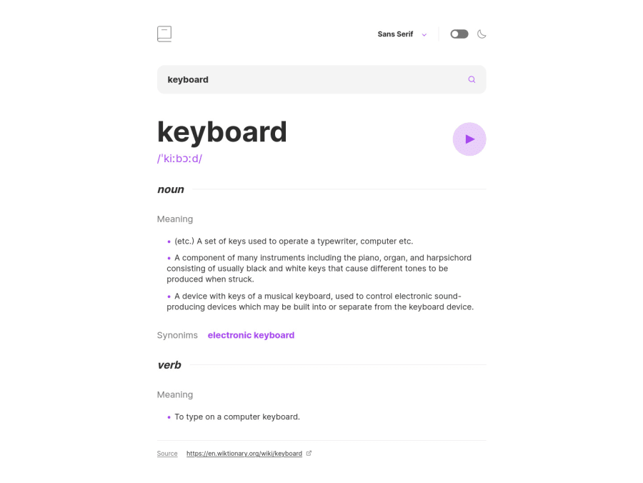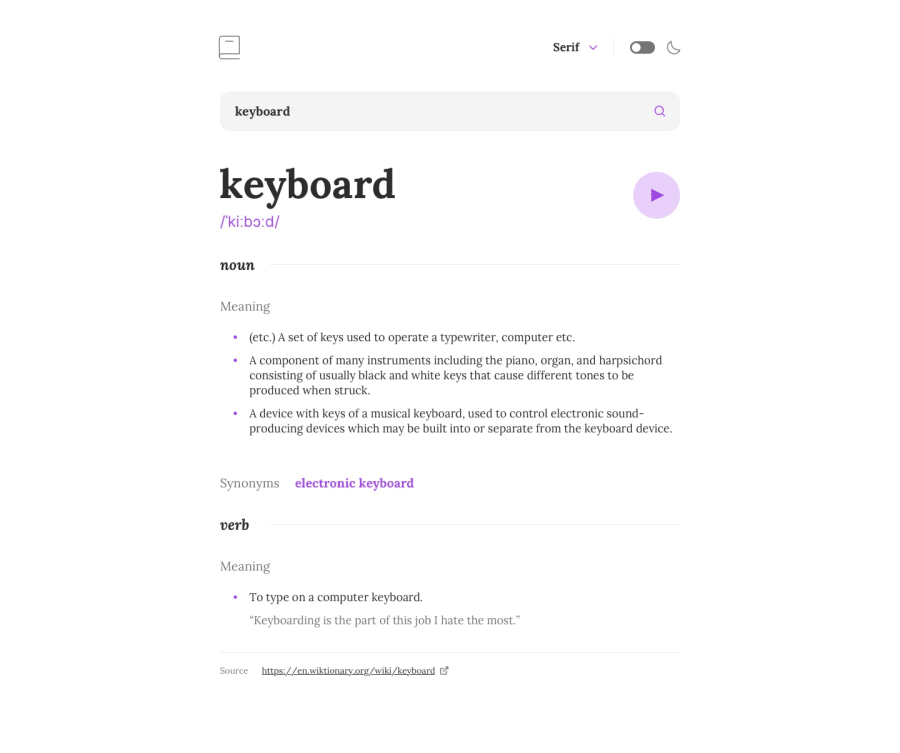
Pixel-perfect responsive page using Next.js and Tailwind
Design comparison
Solution retrospective
This time I tried to use Tailwind to make the site pixel-perfect. I am loving Tailwind more and more because I feel like it makes me more productive.
Community feedback
- @RubenSmnPosted about 2 years ago
Hi Leon, I just looked at your solution for this challenge. Nice job with the theme using the users preferred color scheme! Overall great UI.
I did find some things you could improve upon.
-
When trying to remove the whole word from the search input I was unable to do so. When arriving at the last letter the word just popped back in place. Probably something to do with your state.
-
A nice feature might be to let the user know that the play button has been clicked, maybe even change the icon.
Marked as helpful0 -
Please log in to post a comment
Log in with GitHubJoin our Discord community
Join thousands of Frontend Mentor community members taking the challenges, sharing resources, helping each other, and chatting about all things front-end!
Join our Discord
