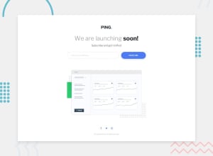
Design comparison
Solution retrospective
It is the last challenge from the newbie category, and I'm done with this category. It was really fun and sometimes pretty challenging. During this time I usually faced problems with
- The image aspect ratio.
- positioning background images to look exactly the same as the challenge (maybe because of the difference between resolution)
- Specifying the with of headings and paragraphs to look like the challenge (I have used
max-width: (*integer*)chbut sometimes it caused unexpected problems in terms of overall width). So I would appreciate it if you address some articles about the mentioned topics.
In the end, I would like to thank everybody who shared their feedback with me and showed love toward my solutions, Many Thanks. Please follow me on GitHub. Let's Go for JUNIOR challenges.
Community feedback
- @elaineleungPosted over 2 years ago
Hi Mahdi, congrats on completing all the Newbie challenges! ⭐
I think this looks pretty good, and if things are a bit larger (such as the image and also the spacing), you can get it looking even closer to the original design. One thing I noticed is that when I input the email, I can hardly see the font color! I think that's something I'd recommend changing, as in, make the input text a different color than the placeholder and to make that color a lot darker as well as the font-size larger.
Anyway, great work with these challenges, and see you in the Junior ones! 😊
Marked as helpful1@MahdiSohailyPosted over 2 years agoThank you @elaineleung for your feedback. I will consider those changes.
0
Please log in to post a comment
Log in with GitHubJoin our Discord community
Join thousands of Frontend Mentor community members taking the challenges, sharing resources, helping each other, and chatting about all things front-end!
Join our Discord
