ping-coming-soon-page-master with HTML,CSS and JavaScript
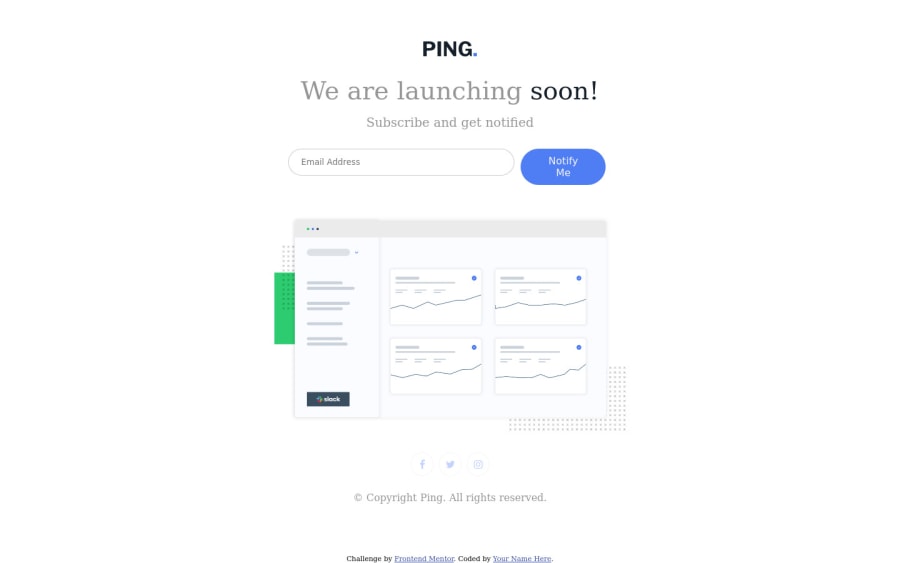
Design comparison
Solution retrospective
I would really appreciate if you all would check out my work and make any valid correction.
Community feedback
- @A-amonPosted over 3 years ago
Hey! The responsiveness looks good. But it seems like you aren't using the fonts they used in the design. Oh, and add white-space:nowrap to #notify button so that the words don't break into two lines. Great work!
0@CodedzephyrPosted over 3 years ago@A-amon I am legit hearing about white-space: no wrap for the first time. Thank you so much and thank you for taking your time to look at it
0 - @palgrammingPosted over 3 years ago
Your problem is that your layout is smaller when the screen is 1000px wide than when it is 700px wide.
0@CodedzephyrPosted over 3 years ago@palgramming that was intentional so that it will stay at the middle and will fit the layout that we were said to use
1@palgrammingPosted over 3 years ago@Codedzephyr The design should just grow bigger as the screen gets wider to accept the bigger width. It should not bounce big small big again. The user experience is worse at 1000px than it is currently at 700px
0@palgrammingPosted over 3 years ago@Codedzephyr look at the size of the desktop elements and once the browser gets wide enough to fit the larger size then transition it once to the desktop size you can look how I did it here https://www.frontendmentor.io/solutions/ping-coming-soon-page-html-and-css-and-js--00k4uQlQ
0
Please log in to post a comment
Log in with GitHubJoin our Discord community
Join thousands of Frontend Mentor community members taking the challenges, sharing resources, helping each other, and chatting about all things front-end!
Join our Discord
