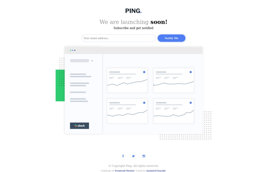
Design comparison
SolutionDesign
Solution retrospective
Hello front-end mentor, here is my completed challenge.
Community feedback
- @ChromeUniversePosted about 2 years ago
Hey there Anointed, congrats on completing the challenge! 🎉 If you'd like to improve on your current solution, here are a couple of suggestions:
- Try using the Libre Franklin font with weights 300, 600 and 700 as suggested by the style guide
- The sizing of the input fields and the button are a bit off: try making them a bit shorter in width and taller in height
- Try adding some left padding to the form's input field and setting a custom color to the input's placeholder to make it look grayed out.
- The Instagram icon is a bit different from the one in the design preview - try using the SVG icons that come bundled with the starter files.
- Lastly, try reducing the hero image's width on desktop - it's looking good on mobile though!
Great job, hope this helps! 😉
0
Please log in to post a comment
Log in with GitHubJoin our Discord community
Join thousands of Frontend Mentor community members taking the challenges, sharing resources, helping each other, and chatting about all things front-end!
Join our Discord
