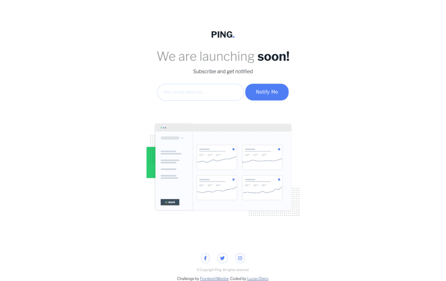
Design comparison
SolutionDesign
Solution retrospective
All feedback is welcome!
Community feedback
- @vanzasetiaPosted over 2 years ago
Hey, Lucas! 👋
It is good to see you completing another challenge! 😄
I notice that you are still using
idto grab an element within the JavaScript even though you were saying that you will usejs-classes to do it in future challenges.Anyway, some suggestions from me.
- The alternative text of the logo should not contain the word "logo" and should not be hyphenated (like code). It's because the screenreader would pronounce it as an image and alternative text should be human readable (like the normal text to read). So, "Ping" would be a good alternative text.
figureelement doesn't need to wrap everyimgelement. The only reason to usefigureis if you need to include afigcaption. Otherwiseimgtag is fine.- Always specify the
typeof thebutton. In this case, set the type of them astype="submit". It will prevent the button from behaving unexpectedly. - Each social media icon should be wrapped by an anchor tag. It is actually the social media link of the company.
That's it! I hope you find this useful!
0
Please log in to post a comment
Log in with GitHubJoin our Discord community
Join thousands of Frontend Mentor community members taking the challenges, sharing resources, helping each other, and chatting about all things front-end!
Join our Discord
