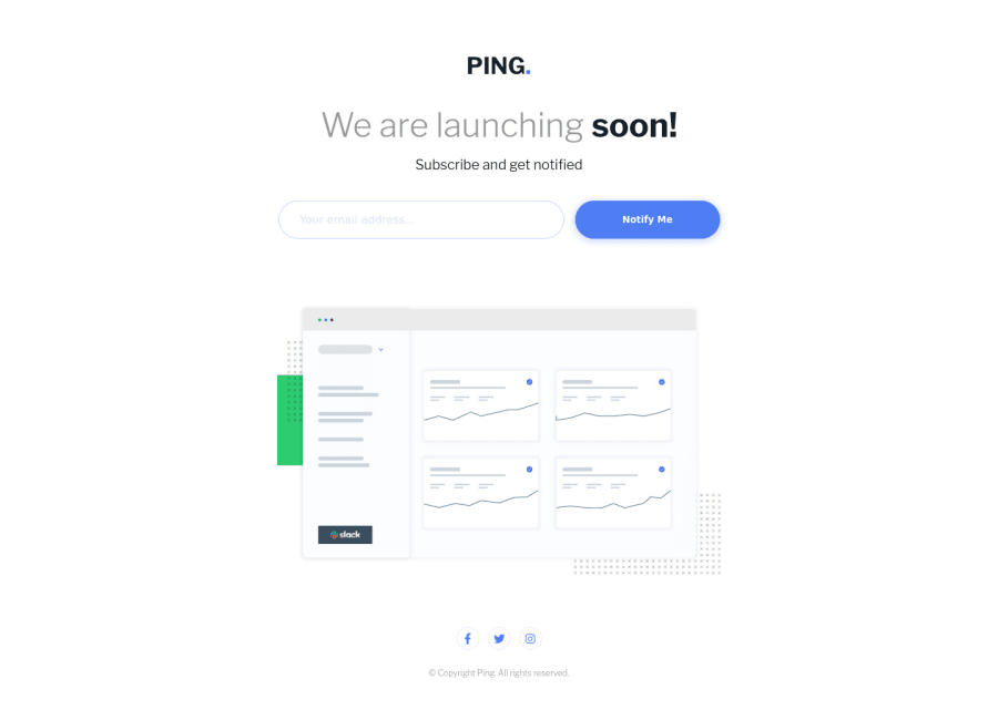
Design comparison
Solution retrospective
Hey all! This is my solution to the Ping Challenge. Would really love some feedback! :)
Especially on the email validation part, how do you validate if the email the user inserted is valid or not? Thank you in advance and happy Coding!
Community feedback
- @pikapikamartPosted almost 3 years ago
Hey, awesome work on this one. Just saw the site and the desktop view looks really nice and the mobile state as well. For the media query, I suggest maybe lowering it down because right now, at 0px-1000px, it is already showing the mobile state. Though it is just a minor change on the overall design, the breakpoint still is too big and you can just make the layout scale with the screen-size so that you could make less the media query.
For some other suggestions, here are some:
- Avoid using
id
to target and style an element since it is a bad practice due to css specificity. Instead, just useclass
to target element. - Remember that a website-logo is one of the meaningful images on a site so use proper
alt
for it. Use the website's name as the value likealt="Ping"
. - When using
img
tag, you don't need to add words that relates to "graphic" such as "logo" and others, sinceimg
is already an image so no need to describe it as one. - Upon looking at the current primary landmark, I saw that you used
section
tags outside themain
. Typically, you will only see this markup on a site:
<header /> <main /> <footer />
As the primary landmarks and all other elements are inside in their respective landmark. For example, the success message and the hero-section image should all be inside the
main
tag, since those contents are the main-content of the site.- Your
input
right now currently lacks associatedlabel
to it or anaria-label
to which will define the purpose of theinput
element. Always include it so that user will know what they need to give on eachinput
. Make sure thatlabel
is pointing to theid
of theinput
as well. - Currently, the error-message is only seen visually and not really connected or linked on the
input
properly. A proper way of linking error-messages to theirinput
looks something like this:
if ( input is wrong ) input.setAttribute("aria-invalid", "true"); input.setAttribute("aria-describedBy", id of the error-message); else input.removeAttribute("aria-invalid"); input.removeAttribute("aria-describedBy");
The error-message element should have an
id
attribute which is referenced by thearia-describedBy
attribute on theinput
element. By doing that, your user will know that the input is wrong because ofaria-invalid
and they will know what kind of error they made because of thearia-describedBy
.- The "notify me" should be a
button
and not ana
tag. Remember that ana
tag serves to direct a user in another page since it is a link, while abutton
controls something and on this one,button
should be used since it will "submit" theform
. Usetype="submit"
attribute on thebutton
on this one. - Also, if you like, I have this simple accessible form which you can reference.
aria-live
is implemented as well so that user will be informed right away on what is the current status. Let me know if you have any queries:> - For the hero-section, it could use a more descriptive
alt
value and like what I said, avoid words likeillustration
. On this one, you could use something likealt="Ping application's user dashboard"
. - When you are using
section
make sure that it has an heading tag inside it that is being labelled to thesection
itself.section
tag is not really informative even if it is being treated as landmark unless it is usingaria-labelledby
. For this one, you can just usediv
to wrap the image. - For each of the social-media links
a
tag, you don't need to use the wordsredirected
since ana
tag is already a link and it will be announce as a link to the user. You can just use the social-media name as thearia-label
and that would be enough.
Aside from those, great job again on this one.
Marked as helpful1@Kristiana12Posted almost 3 years ago@pikapikamart Wow thanks so much for the tips! I am definitely starting to see things differently, especially on naming the
alt
and thearia-label
attributes. And generally how I could have approached the structure of the HTML.I am not that quite familiar with the
aria-
attributes haven't really learned them yet, do you happen to have any resources that you found useful, maybe an article or a video where the aria attributes are being more in detail explained!Thank you so much for taking time to look at my code and for your really very helpful feedback!
1@pikapikamartPosted almost 3 years ago@Kristiana12 Hey, glad that you find my review useful^^
For the
aria
attributes, I don't really have an exact resource about it because I just kind of search one if I needed it to add in my html elements.But whenever I look something up, I always go to digitala11 about WAI-ARIA and sometimes to I go just the mdn docs, just search for aria mdn and I think it will pop something out^
1 - Avoid using
- @Nam-HaiPosted almost 3 years ago
Nice work !! Good use of the input type to handle e-mails.
0
Please log in to post a comment
Log in with GitHubJoin our Discord community
Join thousands of Frontend Mentor community members taking the challenges, sharing resources, helping each other, and chatting about all things front-end!
Join our Discord