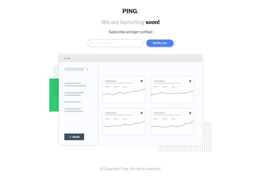

Design comparison
SolutionDesign

Solution retrospective
Tell me what you think.
Please log in to post a comment
Log in with GitHubCommunity feedback
- @josemasf
It is really well worked. Simply missing social media icons and the size of the font in the title and footer I notice it different from that of the design
- @fraserwat
This looks good! Two things I'd change:
- Include the social media icons in the design (check out "Font Awesome" for free icons and loads of tutorials on how to include them in your web designs).
- Also your form element isn't accessible to people using a screen reader or other accessibility issues. Good starting point for this: https://developer.mozilla.org/en-US/docs/Web/Accessibility/ARIA/ARIA_Techniques/Using_the_aria-label_attribute


Join our Discord community
Join thousands of Frontend Mentor community members taking the challenges, sharing resources, helping each other, and chatting about all things front-end!
Join our Discord