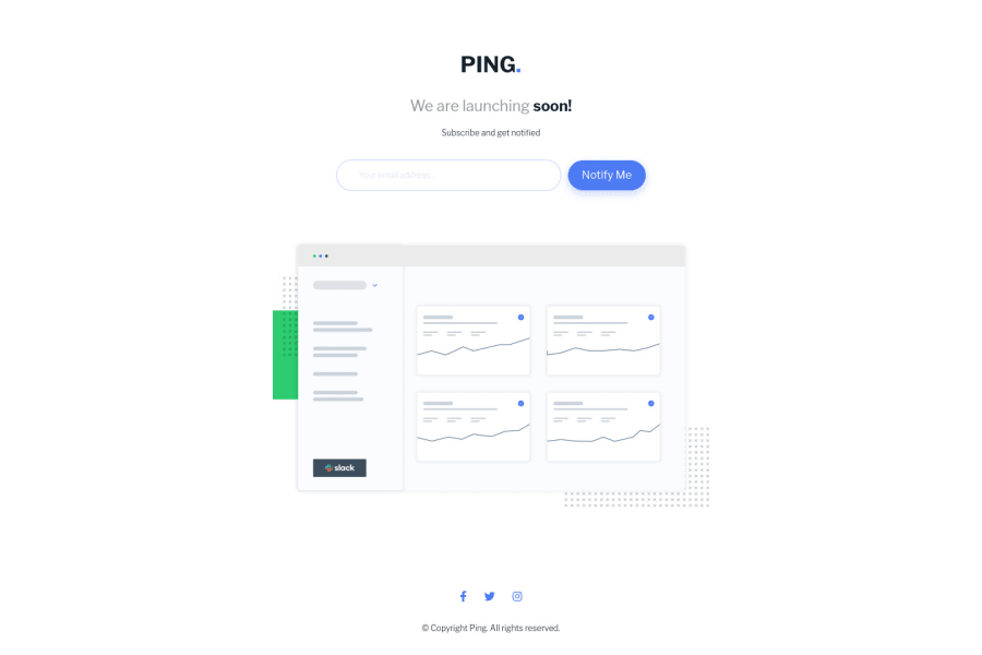
Ping single column coming soon page with some Javascript
Design comparison
Solution retrospective
I think it looks okay, but let me know if you spot anything!
Community feedback
- @jgengo-altPosted about 3 years ago
Hello Graeme Byrne, I'm glad to see you did this assignment!
🪴 Your solution looks great however I think:
🌱 • (UX) • It would have been great if the text input also permit to validate the form with the ENTER key. You could have achieve that by using a real form html element instead of a div or by adding event listener with JS.
🌱 • (UX) • The dashboard image attract all of the focus, it could look a bit better if have lower this effect by increasing the size of your headers in desktop mode to balance it out.
🌱 • (UI) • The error message in desktop mode isn't place properly.
Your mobile version is perfect 👌
I hope it helps Cheers happy coding 💪
0 - @arkharman12Posted about 3 years ago
Success and error message is not properly placed on desktop screens. Otherwise, looks good!
0
Please log in to post a comment
Log in with GitHubJoin our Discord community
Join thousands of Frontend Mentor community members taking the challenges, sharing resources, helping each other, and chatting about all things front-end!
Join our Discord
