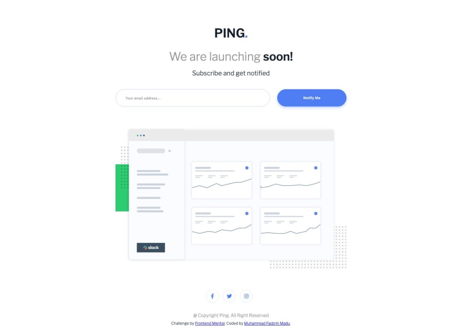
ping single column coming soon page
Design comparison
Solution retrospective
please review my code and let me know what i need to improve, thanks in advance
Community feedback
- @mattstuddertPosted almost 5 years ago
Nice work Muhammad! I've just got a couple of small recommendations, so nothing major:
- I would lowercase the "Ping" logo in your HTML so that screen reader software doesn't read it out letter-by-letter. You can then use
text-transform: uppercase;in your HTML to visually uppercase it. - You've gone straight in with a
h3heading, but you've not got anyh1orh2elements. I would always recommend starting with ah1as your main page title.
I hope this helps. Keep up the great work! 👍
Marked as helpful1@fadzrinmaduPosted almost 5 years ago@mattstuddert very helpful thanks for the feedback. one question how to solve the problem in my report? I have been looking for it but have not found the right solution
0@mattstuddertPosted almost 5 years ago@fadzrinmadu you need to either add some text inside the anchor tag, which you can then visually hide so that it's only accessible to screen reader users. Or you can add an
aria-labelattribute to the anchor tags to provide the link text.0@fadzrinmaduPosted almost 5 years ago@mattstuddert thank you for your answer
0 - I would lowercase the "Ping" logo in your HTML so that screen reader software doesn't read it out letter-by-letter. You can then use
Please log in to post a comment
Log in with GitHubJoin our Discord community
Join thousands of Frontend Mentor community members taking the challenges, sharing resources, helping each other, and chatting about all things front-end!
Join our Discord
