Design comparison
SolutionDesign
Community feedback
- @VCaramesPosted almost 2 years ago
Hey there! 👋 Here are some suggestions to help improve your code:
-
- The logo is not not decorative, Its
alt tagshould not be blank. The description should state the company’s name.
- The logo is not not decorative, Its
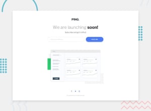
- The intro heading and paragraph should be wrapped inside a
headerelement.
- Your “error message" needs to be wrapped inside a
formand yourinputshould have a visibly hiddenlabelattached to it for improved accessibility.
More Info:📚
- The “illustration” in this component serve no other purpose than to be decorative; it adds no value. Its
alt tagshould be left blank and have anaria-hidden=“true”to hide it from assistive technology.
More Info:📚
https://www.w3.org/WAI/tutorials/images/
- Keep your CSS in a single file, no need to separate everything into separate files; easier to maintain and read.
- When the user enters a valid email, I recommend adding some sort of confirmation stating that the email is valid to improve user experience.
Here is an example of how it can look: **Example
If you have any questions or need further clarification, feel free to reach out to me.
Happy Coding!🎄🎁
Marked as helpful1 -
Please log in to post a comment
Log in with GitHubJoin our Discord community
Join thousands of Frontend Mentor community members taking the challenges, sharing resources, helping each other, and chatting about all things front-end!
Join our Discord
