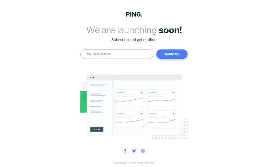
Ping Single Column Coming Soon (SASS + JS)
Design comparison
Solution retrospective
Hello, I have finished this exercise
My first attempt at doing JavaScript for form
validation. Generates a different message depending on the input being blank, invalid format or correct format which has a green color for both the message and the border-color
.
Looking forward to how I can get with Javascript!
Thank you for reading, any feedback is appreciated!
Community feedback
- @VCaramesPosted almost 2 years ago
Hey there! 👋 Here are some suggestions to help improve your code:
- This needs to be inside a
header
element:
<div class="title"> <img src="images/logo.svg" alt="" class="logo"> <h1>We are launching <span>soon!</span></h1> <p>Subscribe and get notified</p> </div>
- This would be inside a
main
element:
<form> <input type="text" id='input' class="email one" placeholder="Your email address..."> <a href="#" class="btn">Notify Me</a> </form> <div class="message error"></div> </div> <div class="animation-down"> <img src="images/illustration-dashboard.png" alt="" class="dashboard">
- While the social media icons and copyright would be inside a
footer
element.
- Your
input
needs to have alabel
attached to it for accessibility and the "button" should be created using thebutton
element not ananchor
element.
- Your JS should listening for a "form submit".
If you have any questions or need further clarification, feel free to reach out to me.
Happy Coding!🎄🎁
Marked as helpful1@LysitheaDarkKnightPosted almost 2 years ago@vcarames Can you elaborate on why the
input
needs to have alabel
attached to it? I did not apply it because there was no text above or near theinput
. Is there more to thislabel
that I'm missing out on?0@VCaramesPosted almost 2 years ago@LysitheaDarkKnight
Accessibility. The
label
would visually hidden, so that only screen readers can pick it up ( I should have mentioned this on previous comment, sorry about that).inputs
should always have alabel
even if they are not seen in the design files. Remember, when building components/sites, some of your users will rely on assistive technology to guide them through your site.A good way to test your site’s accessibility is by using your computer’s voice over.
Hope this clears things up.
Marked as helpful0 - This needs to be inside a
Please log in to post a comment
Log in with GitHubJoin our Discord community
Join thousands of Frontend Mentor community members taking the challenges, sharing resources, helping each other, and chatting about all things front-end!
Join our Discord