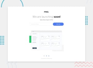
Design comparison
SolutionDesign
Solution retrospective
The hardest part for me was not JS but CSS.
Community feedback
- @shashreesamuelPosted over 2 years ago
Good job completing this challenge
Keep up the good work
Your solution looks great however I think that the following should be considered
-
The title and subtitle needs to be a bit bigger
-
The email address field needs a bit more padding
-
The social icons does not need a blue border.
In terms of your accessibility issues, simply wrap all your content between main tags since it should help get rid of your accessibility issues.
I hope this helps
Cheers
Marked as helpful0 -
Please log in to post a comment
Log in with GitHubJoin our Discord community
Join thousands of Frontend Mentor community members taking the challenges, sharing resources, helping each other, and chatting about all things front-end!
Join our Discord
