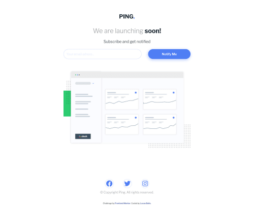
Design comparison
SolutionDesign
Solution retrospective
Hi everyone! My objective in this project was to do my first project using the 3 languages together, so I focused more in JS part (it took me 70% of the time) but it was great to understand how to write a code in HTML and CSS thinking about the JS part.
Community feedback
- @VCaramesPosted almost 2 years ago
Hey there! 👋 Here are some suggestions to help improve your code:
- Your
EventListener
should be on theform
and it should be asubmit
not aclick
, since the user is submitting their email.
More Info:📚
Click vs. Submit EventListeners
- The logo, intro heading and paragraph should all be wrapped inside the
header
element.
- Your
email input
, “error message" andbutton
needs to be wrapped inside aform
and have a visibly hiddenlabel
attached to it for improved accessibility.
More Info:📚
- The social media icons should have a
aria-label
to improve accessibility.
- When the user enters a valid email, I recommend adding some sort of confirmation stating that the email is valid to improve user experience.
Here is an example of how it can look: **Example
- For improved accessibility 📈 for your content, it is best practice to use
rem
for yourfont-size
and other property value. Whileem
is best formedia-queries
. Using these units gives users the ability to scale elements up and down, relative to a set value.
If you have any questions or need further clarification, feel free to reach out to me.
Happy Coding! 🎄🎁
0 - Your
Please log in to post a comment
Log in with GitHubJoin our Discord community
Join thousands of Frontend Mentor community members taking the challenges, sharing resources, helping each other, and chatting about all things front-end!
Join our Discord