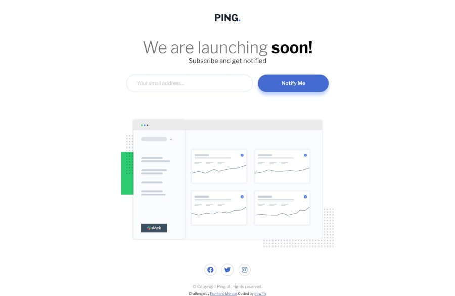
Design comparison
SolutionDesign
Solution retrospective
Another challenge completed.
With this challenge I tried to focus on accesability. Added error validation, and sr-only input description to be easier handled by screen readers. I also tweaked colors that are demanded in style-guide because there was issues during accesability test according to contrast of elements.
Any feedback and tips are welcomed :)
Community feedback
Please log in to post a comment
Log in with GitHubJoin our Discord community
Join thousands of Frontend Mentor community members taking the challenges, sharing resources, helping each other, and chatting about all things front-end!
Join our Discord
