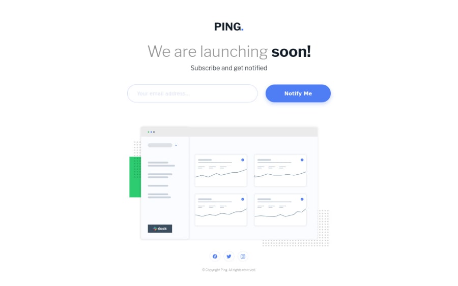
Ping Coming Soon with HTML/CSS/JS, Mobile First, Flexbox
Design comparison
Solution retrospective
Hey everyone, I didn't do something special for this challenge, just HTML, CSS and Vanilla JS with the mobile first approach. I feel I got better after getting almost all the newbie challenges done.
Feedback is appreciated!
Community feedback
- @FluffyKasPosted about 3 years ago
Hey, it's a great solution! It's responsive and the validation seems to work well. I'm not sure though it's wise to use
position: absoluteon the footer as in some screen sizes it can overlap with the other elements.1@iliwiliPosted about 3 years ago@FluffyKas Thanks and yes, I was thinking the same thing, I just couldn't really figure out how to do it otherwise, other than using margin-top. I thought this was cleaner.
0@FluffyKasPosted about 3 years ago@iliwili I think a margin/padding-top would be easier and cleaner. Sometimes the simplest solution is the best ^^
1@iliwiliPosted about 3 years ago@FluffyKas I will try that and see how it works out. Thanks :)
0@iliwiliPosted about 3 years ago@FluffyKas I think I got it, I looked at your solution for inspiration and saw that you used a
footer. For some reason, I forgot that afooterexisted while I was using a class calledcontainer__footer😅. Using afooteractually makes it better, thank you again for the suggestion. 😄1
Please log in to post a comment
Log in with GitHubJoin our Discord community
Join thousands of Frontend Mentor community members taking the challenges, sharing resources, helping each other, and chatting about all things front-end!
Join our Discord
