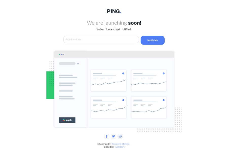
Design comparison
Solution retrospective
Any feedback will be appreciated
Community feedback
- @abhik-bPosted about 4 years ago
Hi Wenadev, your solution looks very nice and its responsive as well..
If I were solving this challenge I would also have added some transition to social icons and I would also give the same height to
Notify Mebutton as theEmail Address field.(these are just opinions)Good job 👌 , Keep it up 💯
0
Please log in to post a comment
Log in with GitHubJoin our Discord community
Join thousands of Frontend Mentor community members taking the challenges, sharing resources, helping each other, and chatting about all things front-end!
Join our Discord
