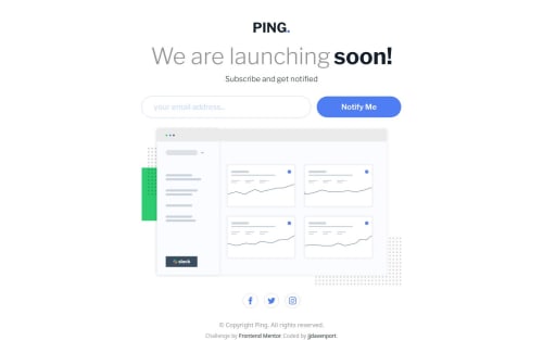
Design comparison
Solution retrospective
First form validation using react.
What challenges did you encounter, and how did you overcome them?The difference between vanilla js and react for validation.
What specific areas of your project would you like help with?Any feedback is appreciated.
Community feedback
- @Simplify4Me2Posted 3 months ago
Hello @jjdavenport,
Congratz on completing the challenge! It looks good š
I noticed that the current workflow isn't mobile-first, which might be why the mobile design lacks margins and has larger font sizes. Shifting to a mobile-first approach could help optimize the layout for smaller screens. You could also consider the PerfectPixel browser extension to ensure your design matches the mockups more precisely.
You've definitely paid good attention to semantic HTML. The
header
tag is currently in themain
tag, though. Typically, theheader
should be a sibling ofmain
rather than a child to maintain proper semantic structure. Also, theul
element used for social media icons could be more appropriate as anav
element, indicating these icons are a form of navigation.In React, your approach of having components depend directly on
assets/data.json
might reduce flexibility. Passing this data through as props could enhance the reusability of your components. The validation logic you've implemented looks like a great candidate for a custom hook. This could keep your components clean and focused.Keep up the great work and happy coding ā”ā”
Marked as helpful1
Please log in to post a comment
Log in with GitHubJoin our Discord community
Join thousands of Frontend Mentor community members taking the challenges, sharing resources, helping each other, and chatting about all things front-end!
Join our Discord