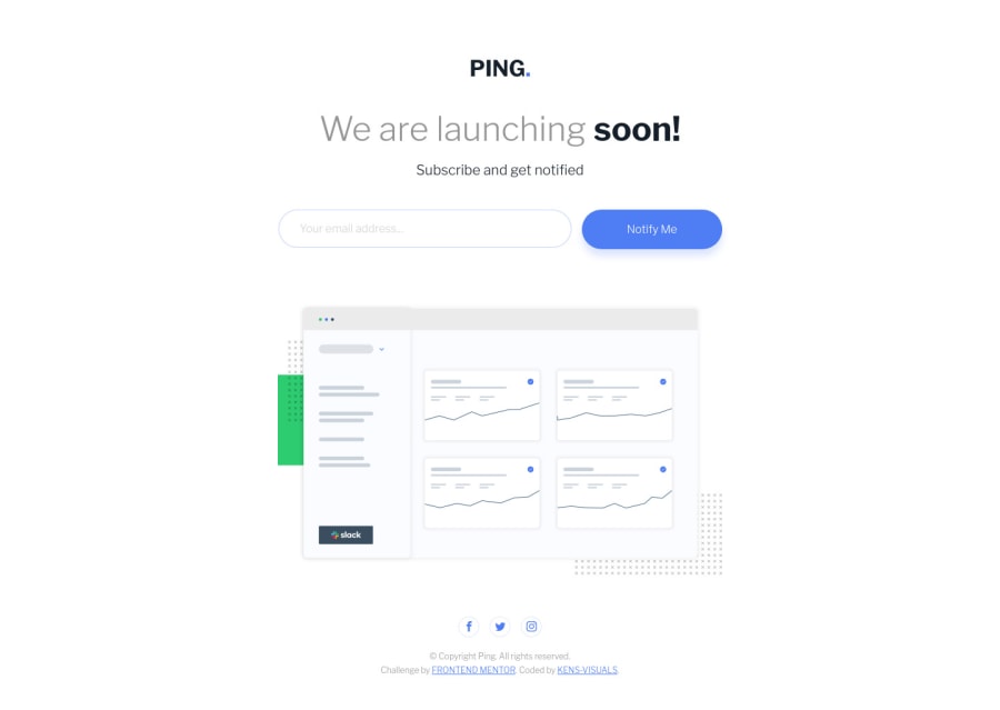
Ping Coming Soon Page with BEM, SCSS, and Vanilla JS
Design comparison
Solution retrospective
It was a fun and simple project, the layout was really easy to put together 🙃 I was already familiar with the functionality, it reminded me of Base Apparel project. So I didn't particularly learn anything new, but I definitely practiced a lot of things from the last project, specifically clamp()
. I'm really excited about the new functions and properties that CSS is coming up with. I can't wait for subgrid
to be available on all the browsers, so we can build layouts more easily.
Feel free to leave some feedback 👨🏻💻 Cheers 👾
Community feedback
- @pikapikamartPosted about 3 years ago
Hey, really awesome work on this one. Desktop layout looks great and responds really well.
Some suggestions on the site would be:
- Use only
alt="ping"
on the website-logo, lose the word "logo" asimg
is image already so no need to describe it as one. - For this one, I wouldn't really use a header, but if I would, I would go:
<header /> # contained the logo <main />
Because using the
header
inside themain
it just renders it as a normal tag and not landmark. Typically, when usingheader
it could be topmost header, it could be an article header something like those but not like this.- To be honest I don't like
placeholder
as their value is being read by screen-reader and it is troublesome when theinput
has alabel
oraria-label
, those will be read plus the placeholder which is really redundant, that is why I uselabel
that looks likeplaceholder
and just animate it according to what I want...This is not a suggestion but you can hold grudges with me at placeholder as well. - Right now your
aria-live
is not doing anything, also usearia-live="polite"
so that it finishes other announcement before announcing another one. To make anaria-live
element fire, you must change the element's text-content.
If ( input is invalid ) arialiveElement.textContent = "form not submitted, check your inputs" else arialiveElement.textContent = "successfully submitted form" # then you could add a toast-notification
- Also on javascript, you can use the
name
attribute of theinput
to target in a form submission so that you won't have to query the element. For example, since yourinput
element hasname="email"
you could do this
const handleFormSubmission = event =>{ const emailInput = event.target.email; # const { input: emailInput } = event.target; .... ...... } form.addEventListener("submit", handleFormSubmission);
- Social media links could be inside
ul
since those are "list" of links. - Each
a
tag that wraps social media, it should have eitheraria-label
attribute or screen-reader element inside it. The value for whatever method you will use should be the name of the social media likearia-label="facebook"
on the facebook linka
tag. This way, users will know where this link would take them. - Each
svg
inside the social media link should be hidden since they are only decoration so usearia-hidden="true"
attribute on them.
Aside from those, site looks great.
Marked as helpful1@kens-visualsPosted about 3 years agoHey @pikamart 👋🏻
- Yap, the first one was an amateur mistake that perhaps due to my old reflexes
- I didn't know that
header
insidemain
renders as a normal tag, so I'll change it todiv
- In this case, I'll remove
aria-label
becauseplaceholder
's is descriptive enough, but I'll keep that in my as another possibility - Well, for the form I did a bit of research, and I ran into this article. So the entire form is based on their instructions, and according to them this is what happens when error occurs.
If validation errors occur, two things happen: 1. The live region is populated upon form submission, announcing to assistive devices that there are errors. 2. Each invalid <input> is given an aria-invalid="true" attribute and connected to a hint using an aria-describedby attribute.
If I'm not mistaken, this line
<div aria-live="assertive" id="message"></div>
should take the message from thisid="emailHint"
and take care of what you wrote in pseudocode. Correct me if I'm wrong.If ( input is invalid ) arialiveElement.textContent = "form not submitted, check your inputs" else arialiveElement.textContent = "successfully submitted form" # then you could add a toast-notification
- I've got so used to selecting items with
querySelector
that I absolutely forgot about the possibility of selecting them withevent
😂 but true, I could also do that. - Honestly, I never looked at those links as list items, maybe it's just me 🤔 I think I have to redo a couple of things here 😂
- @FluffyKas mentioned the possibility of putting icons inside links and giving them proper destination, and this was my answer: "If this was a landing page of a real company or if Frontend Mentor provided some fake accounts to link to, I'd definitely do so. However, since they would take a user to an empty Facebook or Twitter page, I didn't consider doing it, but good point.". That's why I just put them in a
div
just for the sake of the completion of the design. And I checked them with Mozilla's accessibility tools sincesvg
s have<title>
s they were correctly shown in the DevTools. I guess your point is if I had them ina
I should addaria-label
. - The reason for not adding
aria-hidden="true"
is partially connected with the last point, where I mentioned that they use<title>
to give proper information. So if I try to addaria-hidden="true"
to allsvg
s, they won't show up in accessibility dev tools at all.
Thanks for taking the time to give so much insightful information, I really appreciate it, and I'm always open for further discussion 👨🏻💻 Cheers 👾
1@pikapikamartPosted about 3 years ago@kens-visuals Hey, glad to be back in here.
- For the live region, yep it should be populated, but, populated by you as the developer. It is up to you what text-content you are going to put in the
aria-live
element. The article is not clear enough and didn't say that you should add the text-content which they should have. But yeah, you should put a text-content if you want thearia-live
to fire. - For the social-media-icons. They are typically hidden since they link that they are being nested with already gives the content it need, hence the
aria-label
or a screen-reader only text, leading to what social-media they are going to. If ansvg
is meaningful enough, you add antitle
element inside thesvg
with anid
attribute, which will be referenced by thesvg
itself as the value foraria-describedBy
. Because usingtitle
alone inside thesvg
, screen-reader ( or I think nvda ) won't be read, that is why includearia-describedBy={id of the element}
for it to be labelled, but if thesvg
is decorative only, do not addtitle
and add onlyaria-hidden="true"
.
1@kens-visualsPosted about 3 years agoHey @pikamart, glad to see you back again.
- Oh I see now, that's what threw me off because what I thought the article said is that if you add
aria-live
and connect it with yourJS
it would be good enough for it to fire. Thanks for the clarification. - Got, it already made the changes for this one, I'll work on
aria-live
later on.
Thanks again for informing about all these a11y things, it may not be the main part of our job, but it certainly is very important. Cheers 👾
1 - Use only
- @FluffyKasPosted about 3 years ago
Hiya, great implementation, everything looks very very neat (your code as well)! It's awesome to see a detailed README added ^^ Not much to nitpick here but I'll try:
-
"ping logo" alt text could be just "Ping.", no need to add words like logo. Ending your alt texts with a . will be helpful for screen readers too. More on this topic here
-
Adding an aria-label to a button that has a descriptive text inside already is probably not necessary.
-
You could make your social icons really clickable, not just look clickable with
cursor: pointer
. Probably links would be more appropriate here?
+1. If you really wanted to improve accessibility, adding focus to the buttons, links and input would be a great idea!
Marked as helpful1@kens-visualsPosted about 3 years agoHey @FluffyKas 👋🏻
- I usually tell everyone the same thing, but I guess my reflexes worked against me 😂
- I was not sure about that one, so left it to get some feedback, thanks for mentioning.
- If this was a landing page of a real company or if Frontend Mentor provided some fake accounts to link to, I'd definitely do so. However, since they would take a user to an empty Facebook or Twitter page, I didn't consider doing it, but good point.
Innately, I had a focus
state
but for some reason, perhaps design related, I removed them, but I'll make sure to add them back.Thanks for the great feedback, I really appreciate the compliment and you, taking some time to review my project.
0 -
- @kenreibmanPosted almost 3 years ago
Hey! It's me asking for help again. I completed the "Ping. coming soon" page today, uploaded it to the solutions page, and there's this weird gray space at the bottom of my solution when frontendmentor shows it as a preview on their solution page. There is no gray space when I view it on the browser normally on any device.
I asked a few people on Slack without any luck and was wondering if you have any idea how this is happening. This is the solution link
0
Please log in to post a comment
Log in with GitHubJoin our Discord community
Join thousands of Frontend Mentor community members taking the challenges, sharing resources, helping each other, and chatting about all things front-end!
Join our Discord