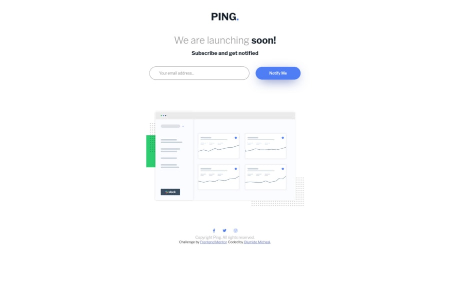
Submitted about 2 years ago
Ping coming soon page using html, css and javaScript
@codewithmide
Design comparison
SolutionDesign
Community feedback
- @romila2003Posted about 2 years ago
Hi Olamide,
Congratulations 🎉 for completing this challenge, it was a great attempt. The card looks great however there are some issues I want to address.
- It is great that you used the right semantics for the
headerand thefooterhowever the main content is missing a semantic therefore I would suggest you wrap the main content within themaintag. - Also, I noticed that you used a desktop-first approach and not the mobile-first approach. It is best practice to use the mobile-first approach as it would be easier to rearrange your layouts, as the screen size increases. For your future projects, I hope you consider this and there are many resources that can help you with this concept if you are unsure of this concept.
- I've also noticed a lot of white space around your image that causes the
footerto be quite down as a result of this. It may be best to remove theheightproperty to reduce some space.
Overall, great attempt and wish you the best for your future projects so keep coding 👍.
Marked as helpful0@codewithmidePosted about 2 years ago@romila2003 Thank you for the corrections. I will do the necessary ones now and take others into consideration when doing new projects
1 - It is great that you used the right semantics for the
Please log in to post a comment
Log in with GitHubJoin our Discord community
Join thousands of Frontend Mentor community members taking the challenges, sharing resources, helping each other, and chatting about all things front-end!
Join our Discord
